Clico — An AI Coworker for macOS
From a bold homepage concept to an interaction model, a character system, and code merged into production.
Clico concept film: I handled the script, storyboards, generation, voiceover, and editing. After scripting, production took just half a working day.
About the project
Clico is an AI coworker that lives on the macOS desktop. A shape-shifting character stays on screen, the notch acts as its second body, and a full client window appears only for deeper work. Over six months, the product changed names twice (Myco → Invoko → Clico) and evolved from an assistant inside a window into a coworker on the desktop. There was no established pattern to copy. The team was small, one person owned design and frontend work, and every ambitious idea had to pass a practical test: would users welcome it?
As the only full-time designer, I owned product architecture, interaction design, brand and character design, motion, and most of the frontend implementation. My workflow was consistent: explore and finalize in Claude Design, implement with Claude Code, review in the Lab tools I built, verify in the native app, then merge. Over six months, 40+ pull requests shipped to production, including 17 I merged myself.
What we did
Inside the window or on the desktop? The first proposal placed the character at the center of the client. It was too radical, so I moved the character outside the window. The client kept a familiar sidebar; the character became a persistent desktop companion. Familiar structure inside, room to experiment outside.
A face or a geometric form? The cloud had eyes and expressions, but an anthropomorphic character limited the range of states it could communicate and risked looking like other products. We chose Contour, a layered geometric form that expresses state through motion rather than facial features.
Rive or Lottie? The cloud used Rive. Before switching Contour to Lottie, I built a JSON feasibility prototype to verify that it could support all ten states and their transitions.
The first proposal: center stage, rejected, then given a new home
In March, I was already designing the character as a coworker rather than an assistant icon. The proposal never shipped, but its central idea survived in a different form.
My first client homepage in March 2026 put the character at the center. An employee card showed its name, role, and employer. Two dock-style icons formed the bottom navigation, and sticky notes held tasks. The interface changed with the character's state, making it clear whether it was organizing, executing, or writing code. The proposal departed too far from familiar desktop apps, so we shipped a conventional sidebar layout, which I also designed. Two months later, the original idea found a compromise: the window stayed familiar, while the character moved onto the desktop and gained the notch as a second body. The ambitious part survived outside the window.
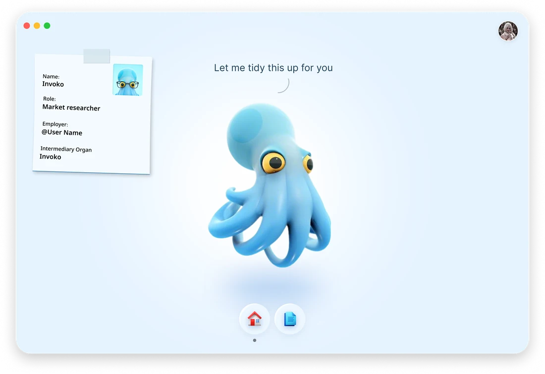
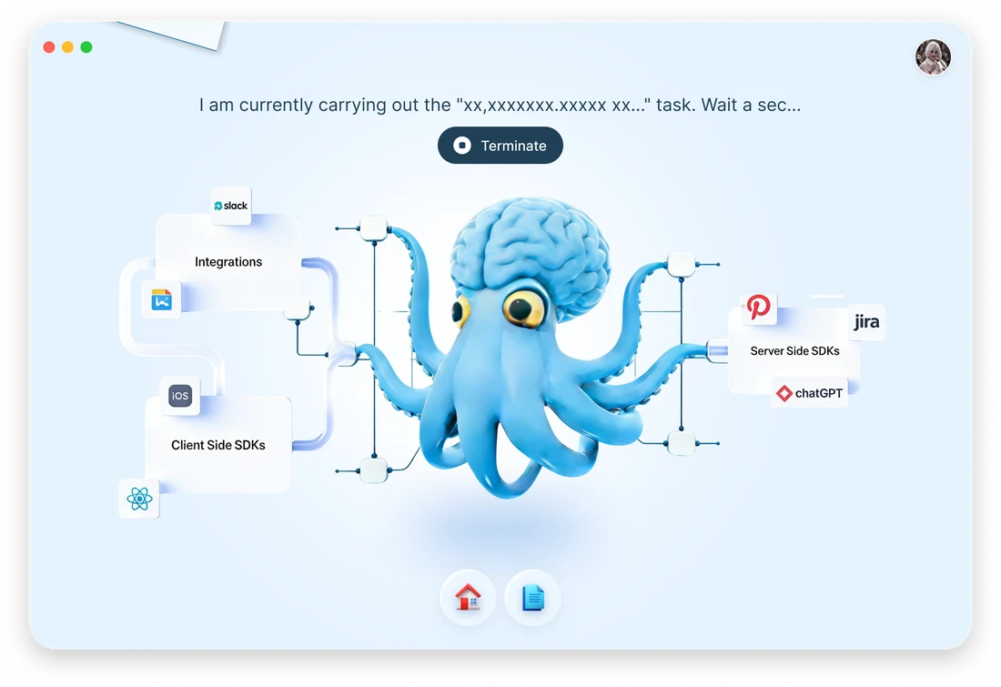
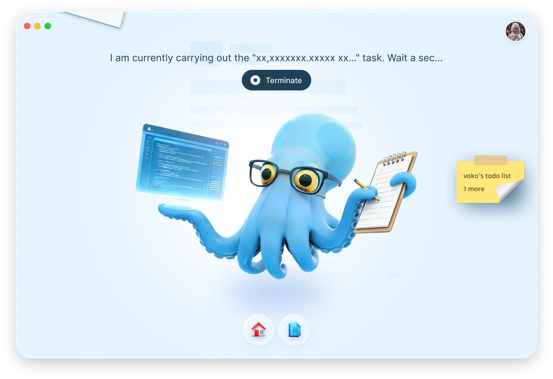
The first homepage in March: a central character, dock-style navigation, and sticky-note modules that respond to its state.
May: the same idea finds a new home. The character lives on the desktop and celebrates beside the window when a task is complete.
Tasks were divided into four mutually exclusive categories: text generation, image and video generation, complete tasks, and other work. Each had its own character pose.

Invocation: trigger × surface × level, with one active character surface at a time
I defined the product's interaction model before drawing the interface: when it appears, where it appears, and what it can do.
Before designing screens, I defined Clico's invocation model: three triggers (poke the character, double-tap ⌥, or appear proactively), two surfaces (desktop character or notch), and three levels (full panel, expanded panel, or a single-intent reminder). A three-layer action system sits on top: persistent, invoked, and proactive. The notch and desktop character share this model, with only one visible at a time. The character can be tucked into the notch or pulled back onto the desktop. Every later interface, from the four chapters of the proactive concept to each onboarding iteration, follows this model.
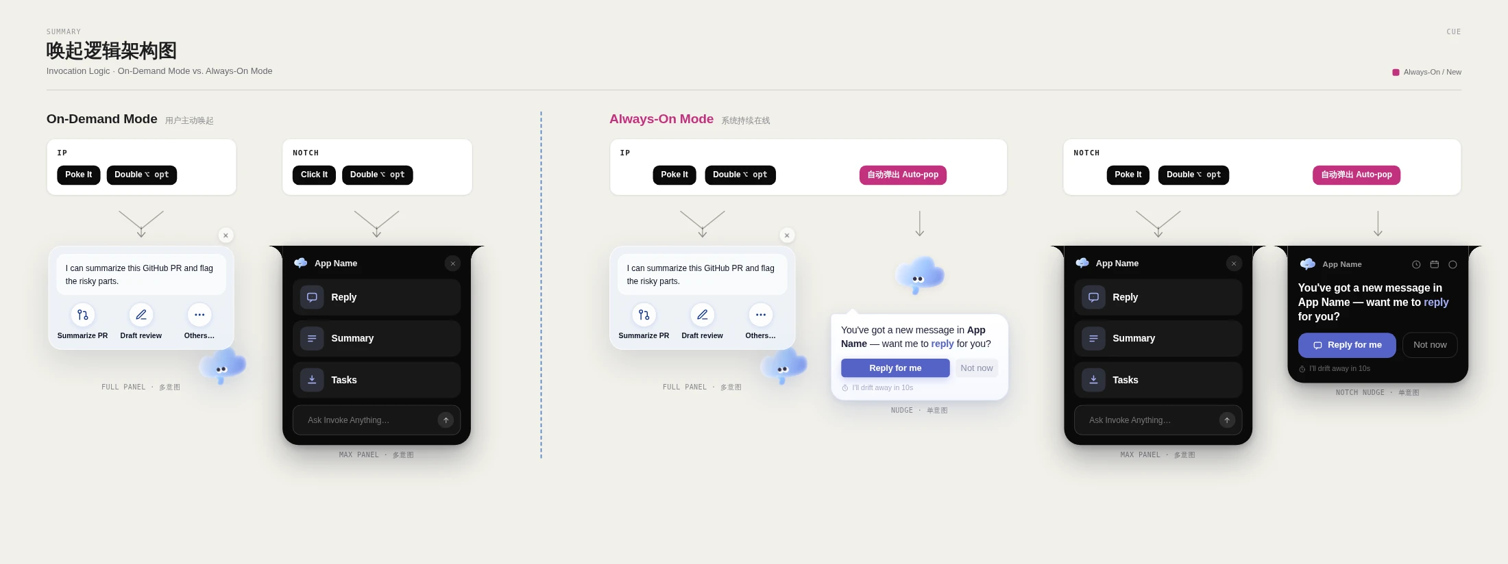
Invocation map: trigger × surface × panel level.
This is the working Design Lab I used to explore the product. The character and notch behaviors, along with different levels of proactivity, are all adjustable. Try the controls.
Four character generations, one state contract
Octopus, cloud, four geometric directions, then Contour. The character changed four times, but the state names stayed the same, allowing the widget, notch, and onboarding to change appearance without changing their logic.
The character is both the product's face and its state indicator. We started with an octopus in March, then a cloud with eyes in May, with 15 Rive states in the client. In July, I explored four geometric directions and moved away from anthropomorphism. In August, we finalized Contour and integrated it through Lottie. I also investigated a meme-inspired direction in depth. We could learn from the visual style, but existing characters had owners and would need an IP review before commercial use, so we set that direction aside. All four generations share one state contract: idle, listening, thinking, outputting, done…The names never changed. That is what allowed us to change the appearance without breaking the logic. Contour's visual rules became a checkable specification, with numbers for everything from cross-section proportions to twist angles.
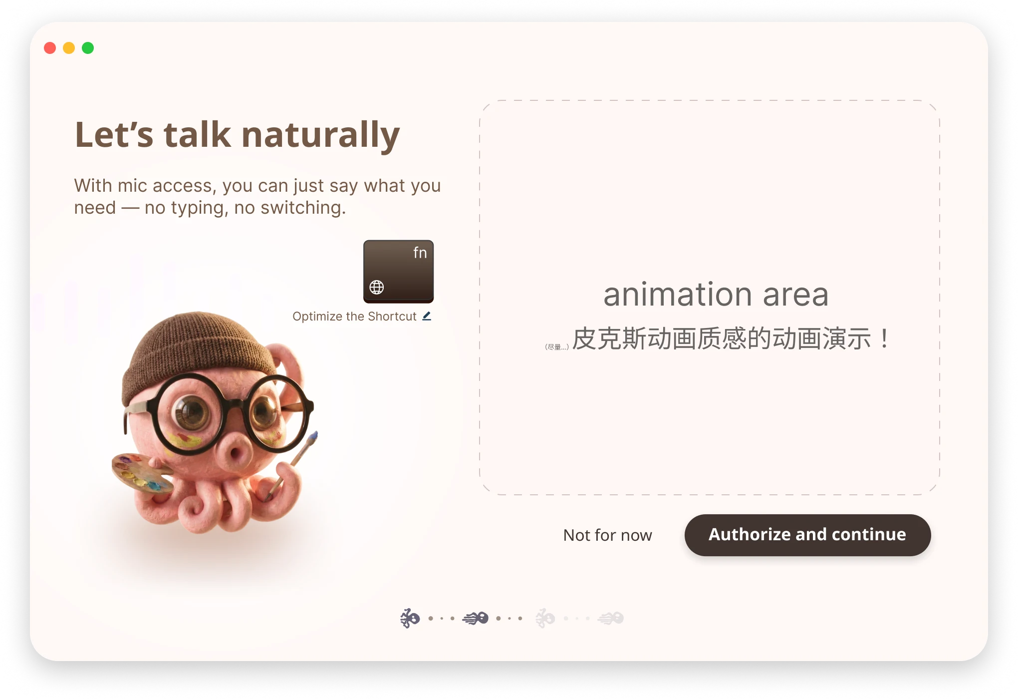
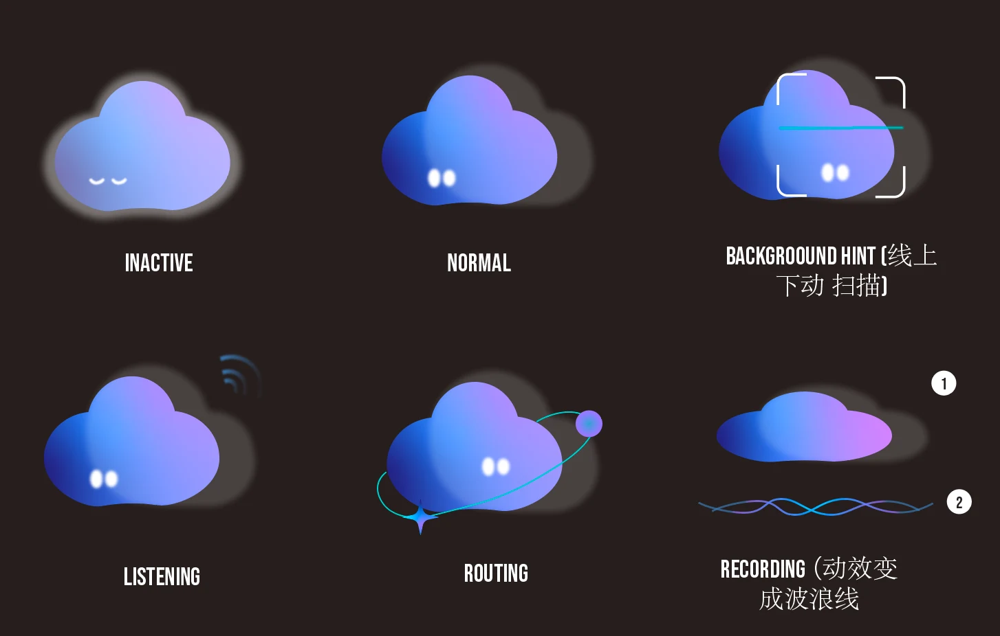
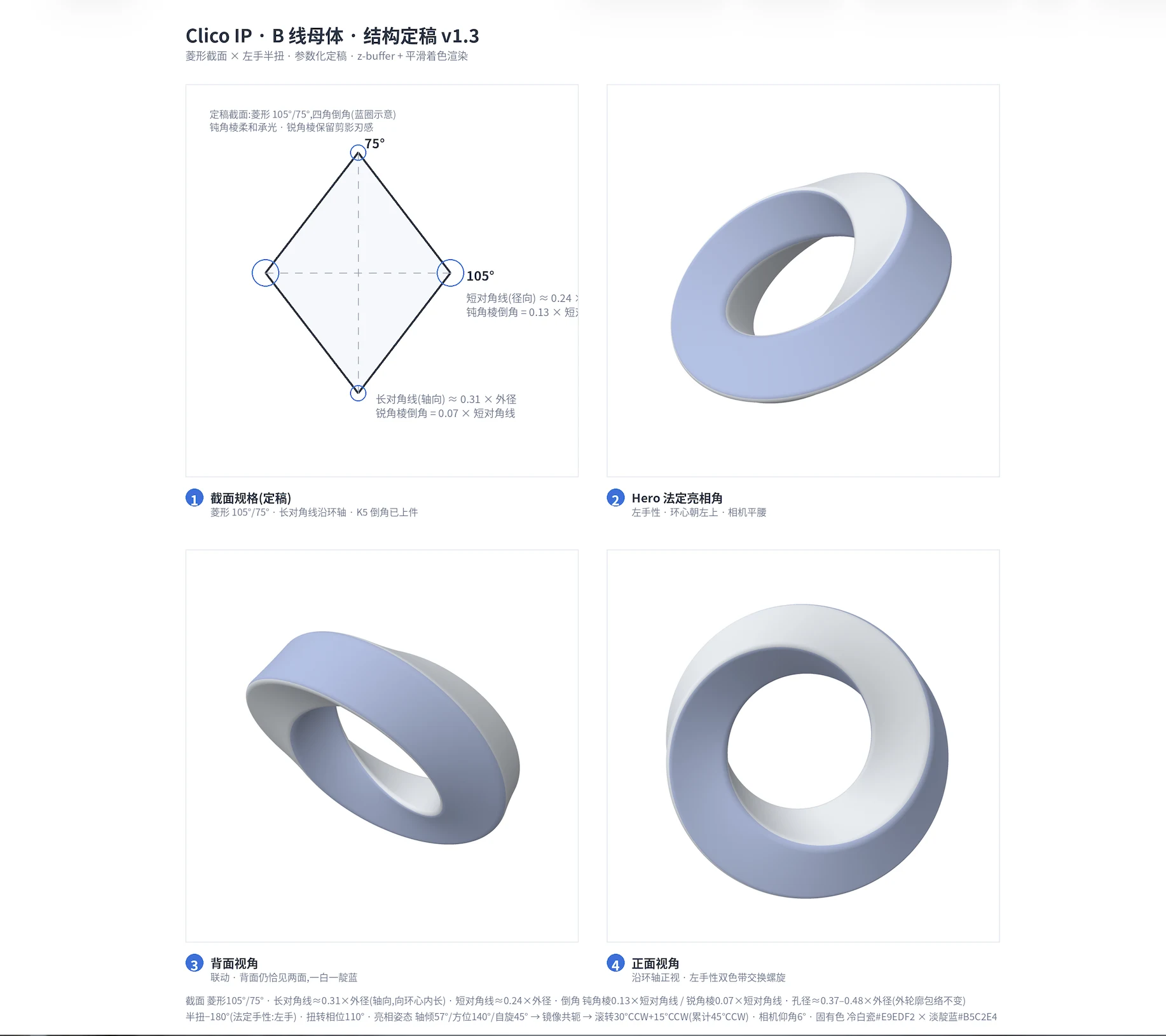
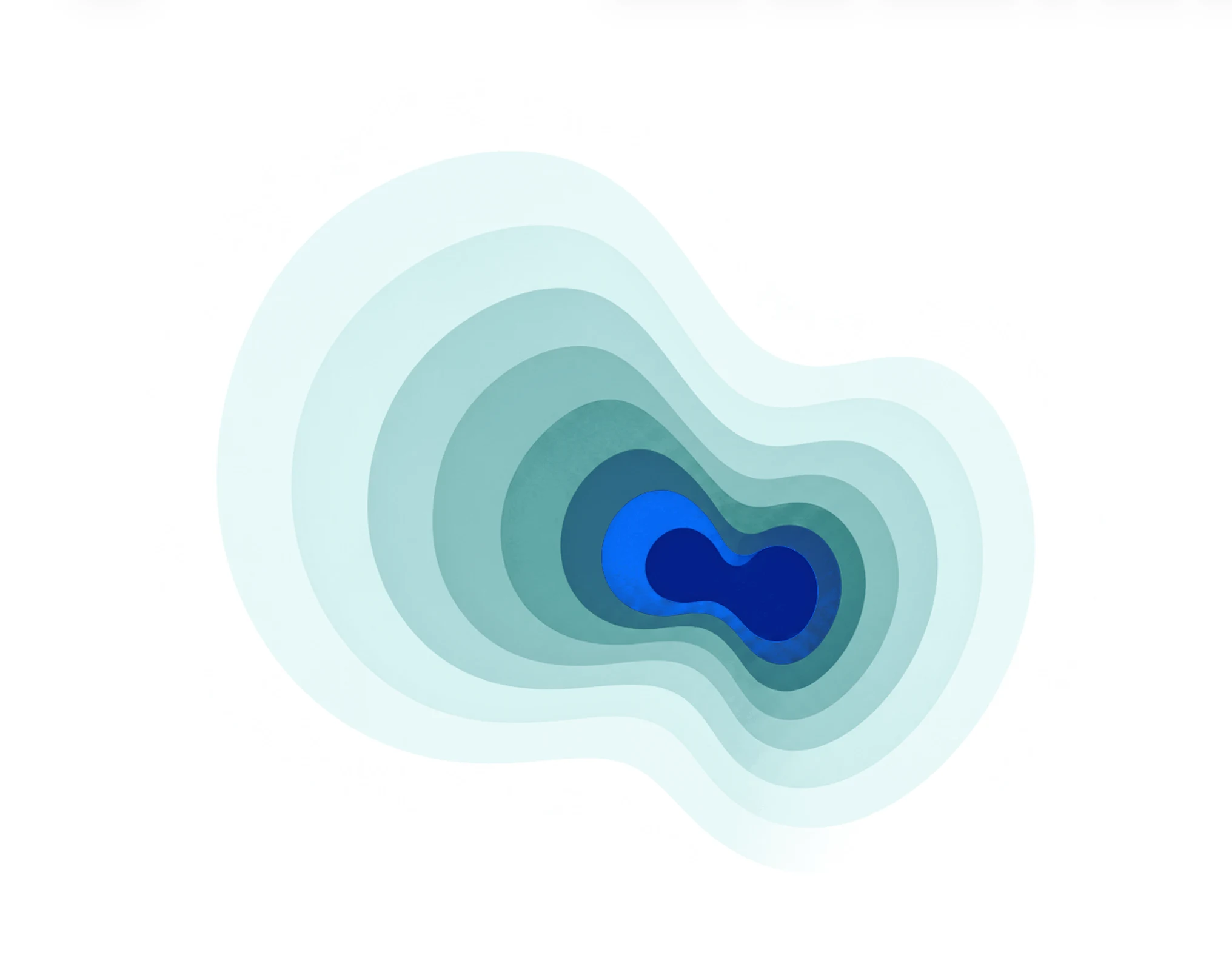
Four generations. Contour was the final choice: state expressed through shape changes rather than facial features.
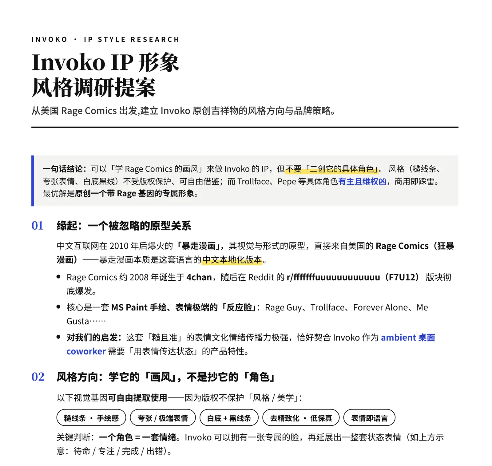
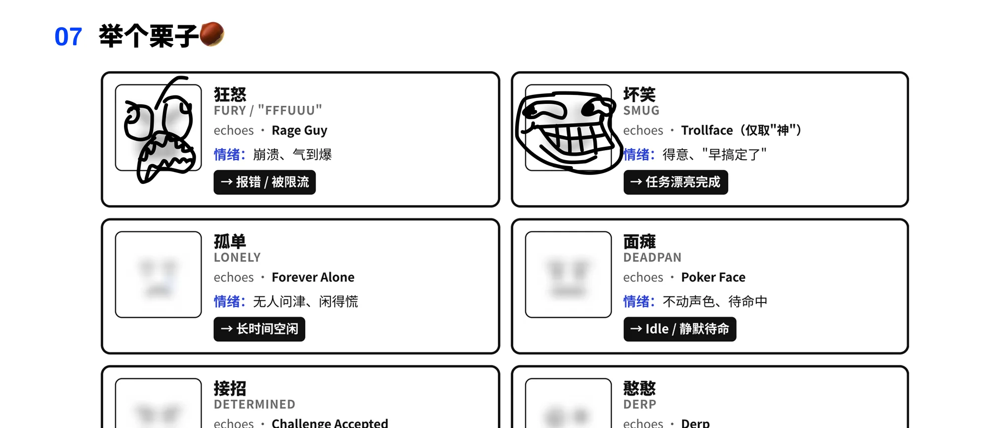
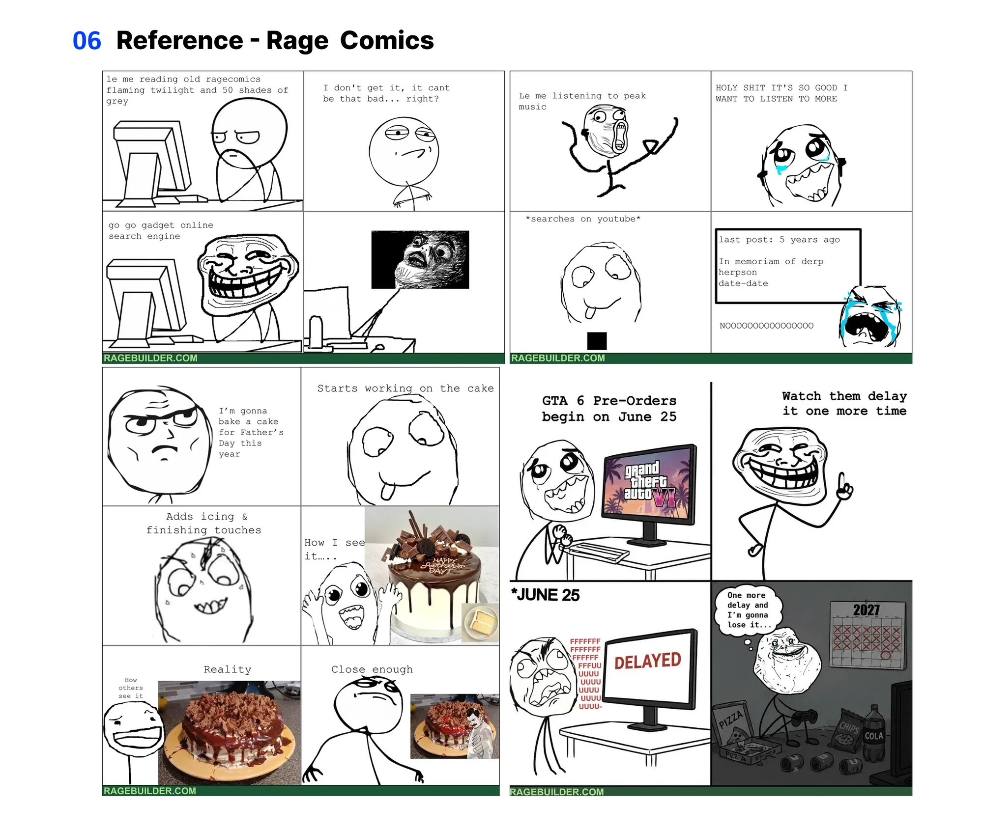
An abandoned direction: meme-inspired visuals. The style offered lessons, but the characters required an IP review before commercial use.
Select a state to explore the actual Lottie assets used in the Clico client.
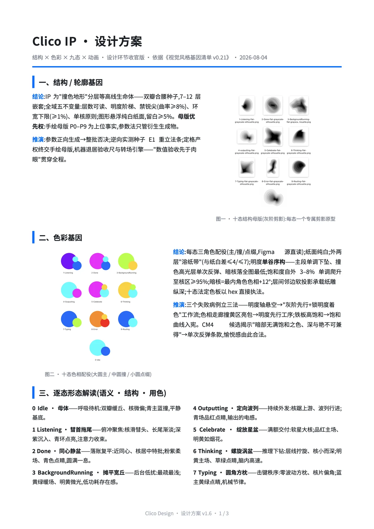
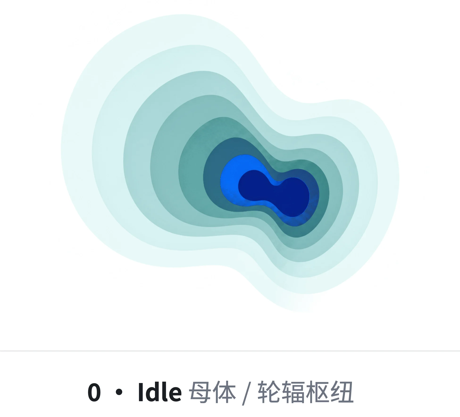
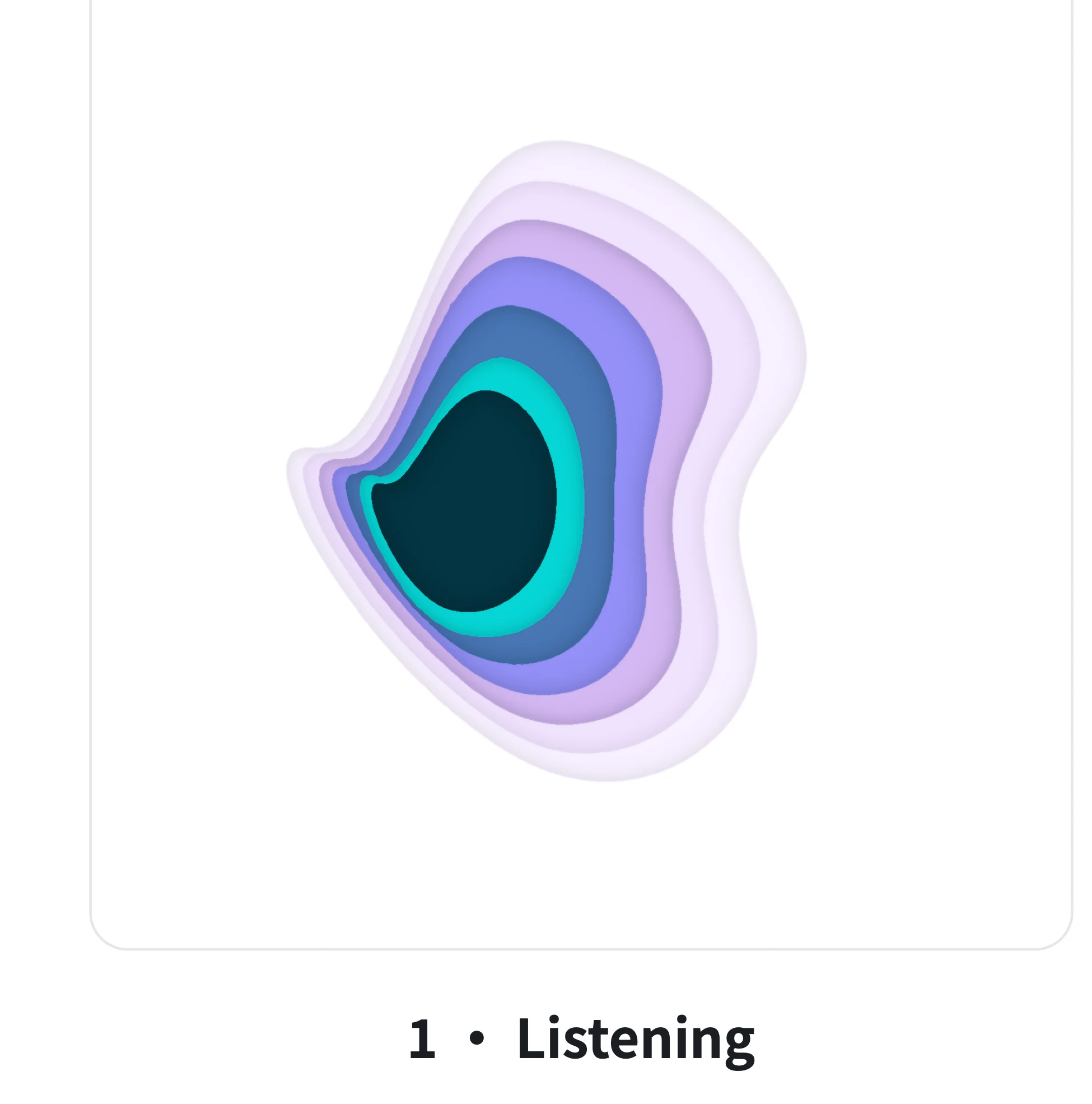
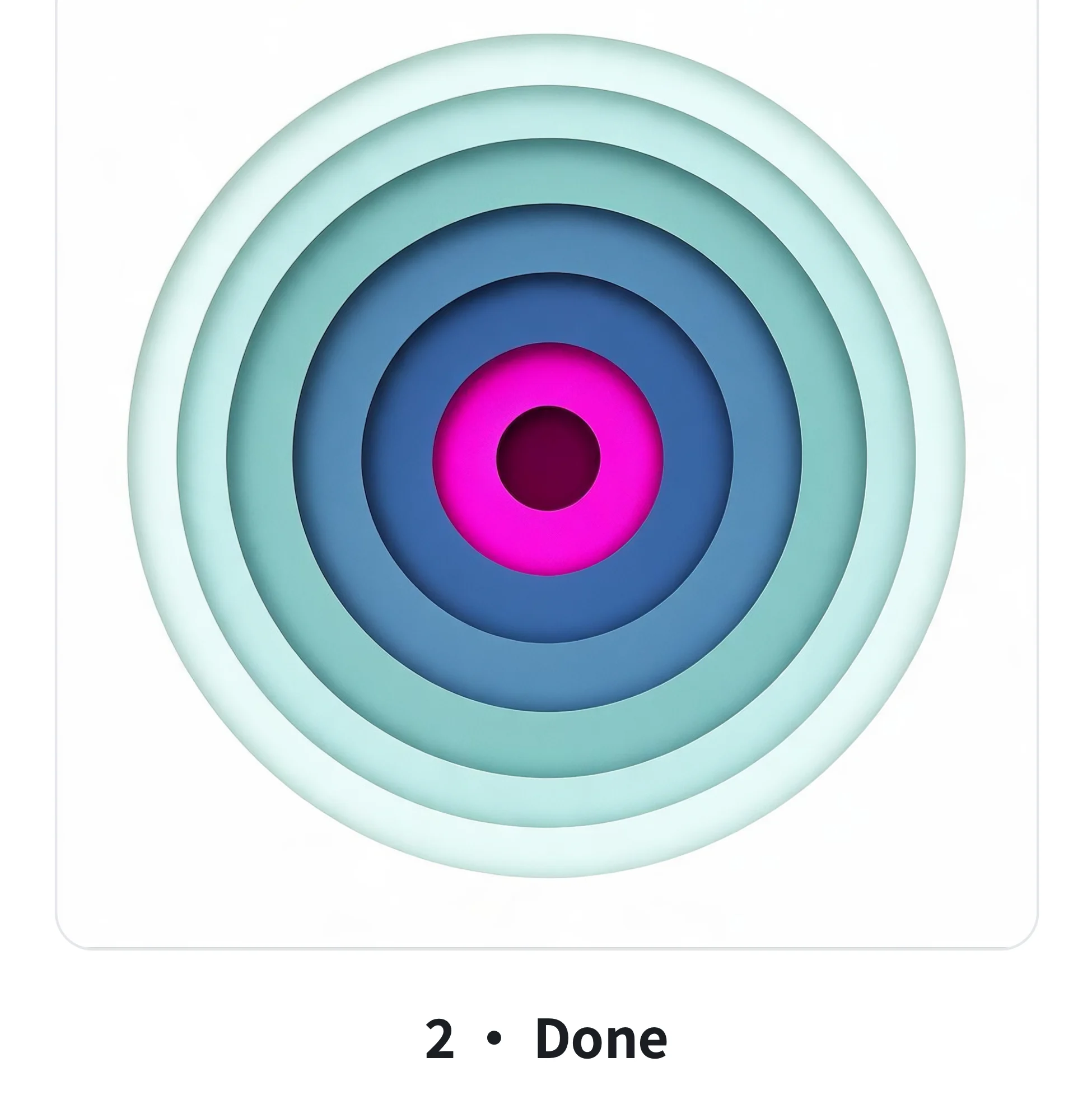
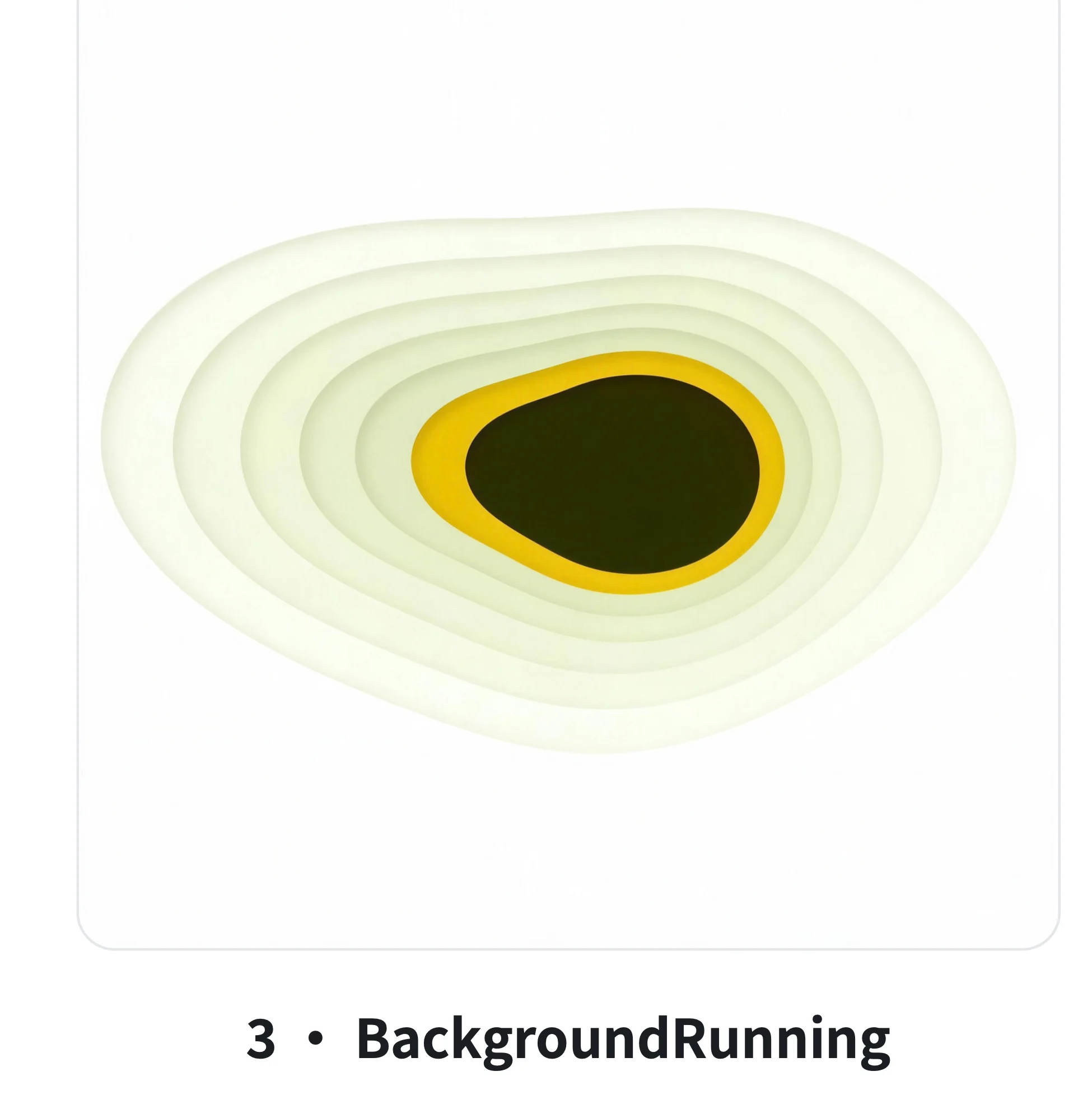
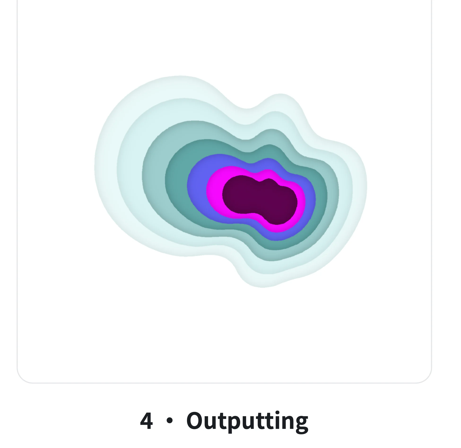
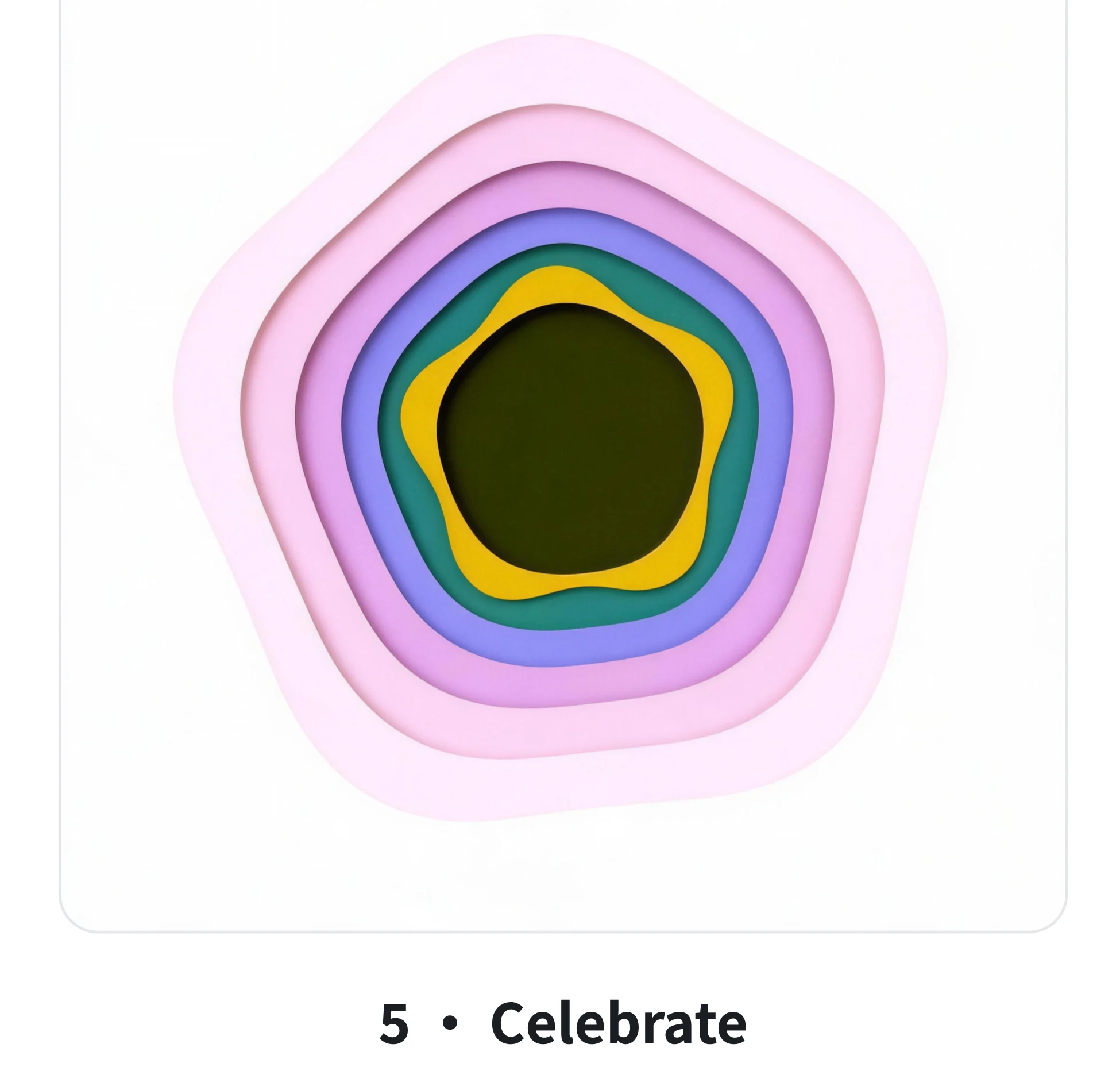
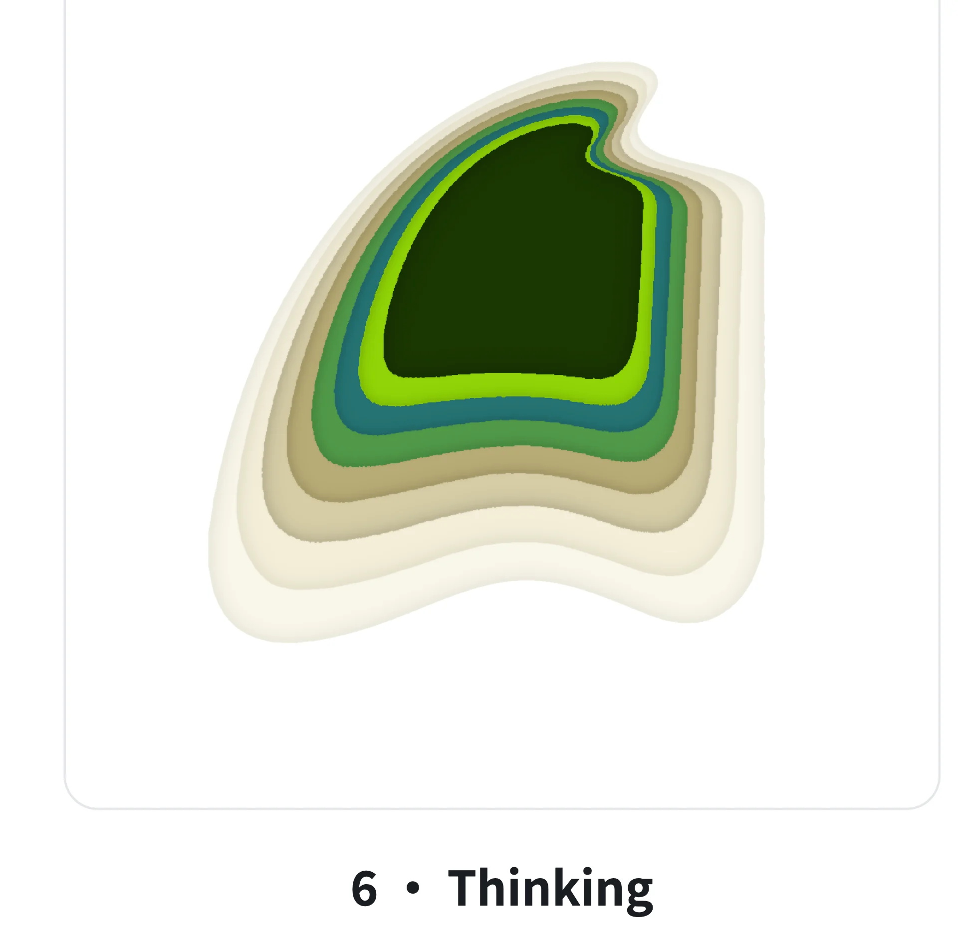
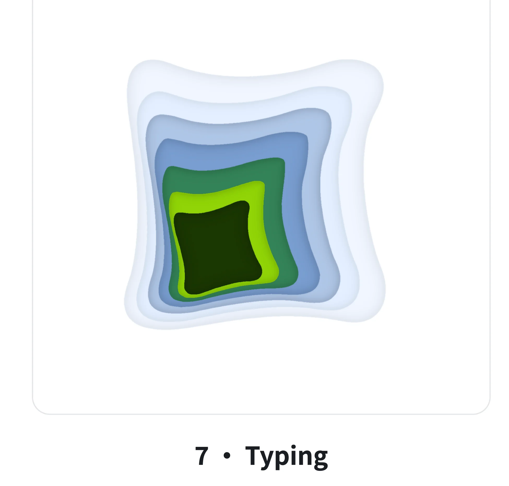
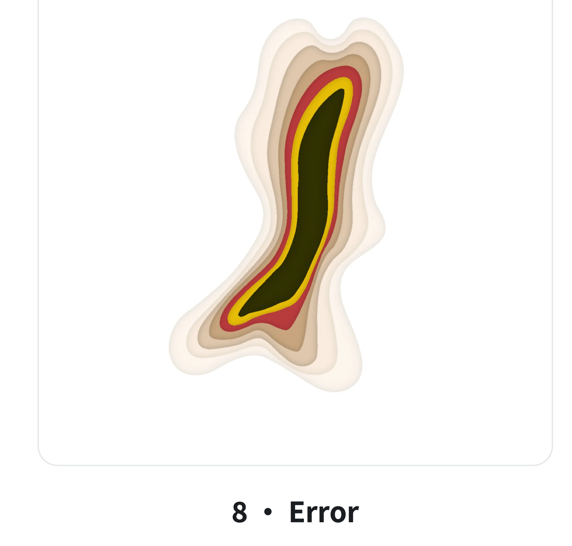
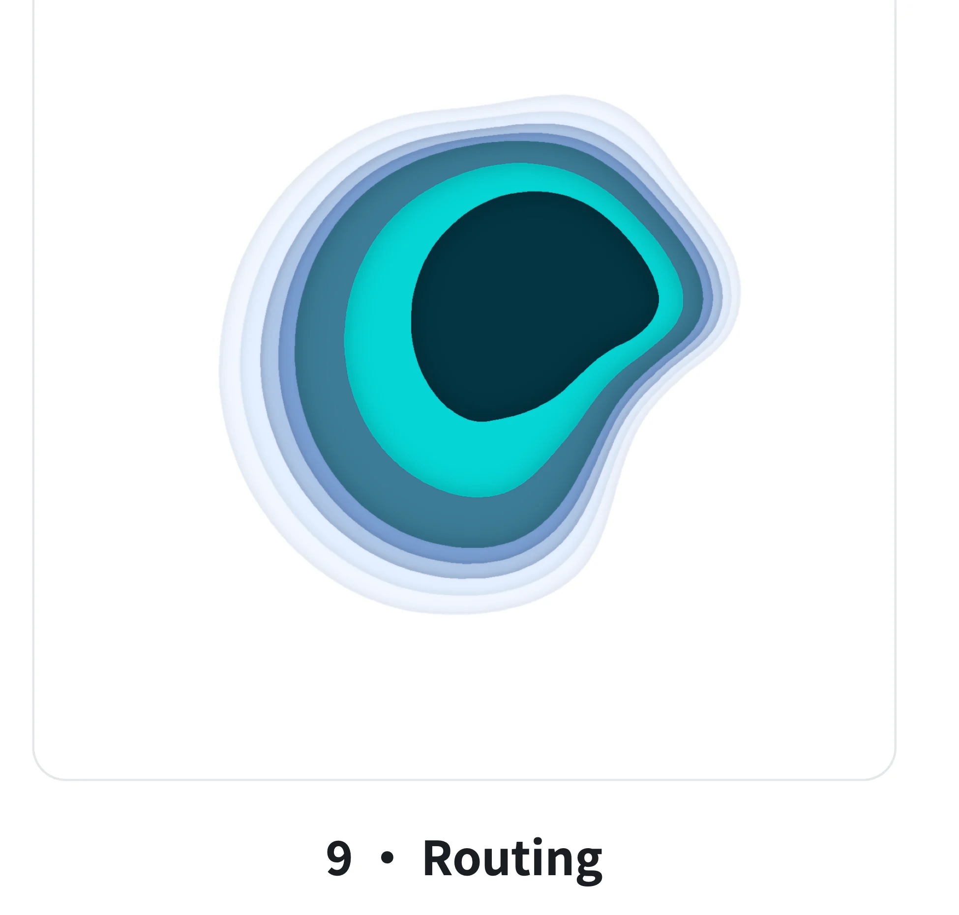
Ten states, one handbook: shape, timing, and purpose for each state.
From patterns to pixels: handing off numbers, not impressions
I translate visual judgment into parameters, and trace AI-generated implementation bugs to their root cause.
The widget handoff avoids vague requests like “bigger” or “softer.” Ring radius: 82 → 132 pt. Angular spacing: 30° → 22°. Contextual action cache: 60 seconds. Icons: SF Symbols. Every decision can go directly into code. I compare the design and the native implementation side by side, describing differences numerically. When generated code is wrong, I investigate: a source change that never appeared turned out to have a duplicate embedded in Swift; an inconsistent button was tied to the wrong typography token.
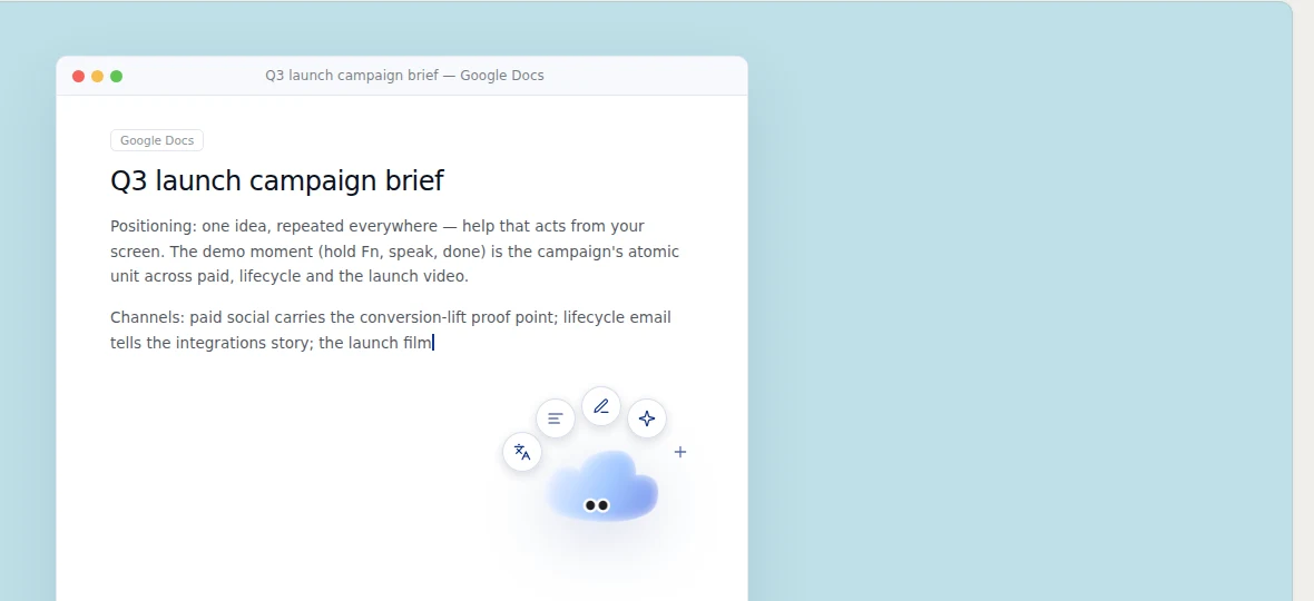
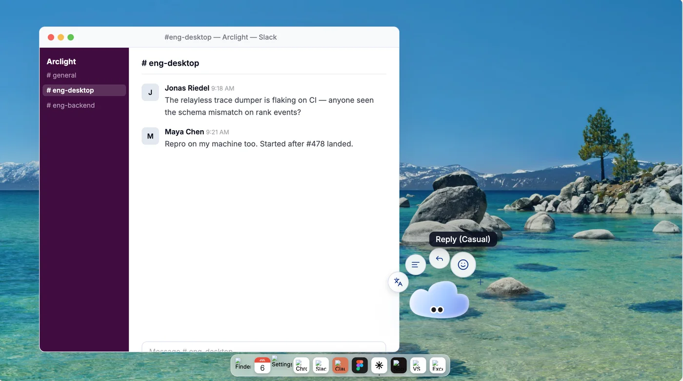
Left: the handoff. Right: the native implementation. Differences expressed in numbers.
Building my own review tools: IP Lab, IP Lottie Lab, and Onboarding Lab
I review design in the actual app. To make that practical, I built three testing environments inside the client.
The client's Debug menu contains three Labs I built. IP Lab switches characters and states. IP Lottie Lab plays Contour's ten state loops and nine transitions, with light, dark, and desktop backgrounds, size controls, and reverse exit playback. Onboarding Lab replays the first-launch experience. Those tools eventually became product features: In May, switching characters was a developer-only dropdown. By August, it had become two animated preview cards in Settings: Contour and Cloud. Selection took effect immediately and persisted across restarts. It then moved into onboarding as step zero: choose a coworker for your desktop. I also used the team's Notch Lab sandbox to refine notch states and action semantics through six rounds beginning in April.
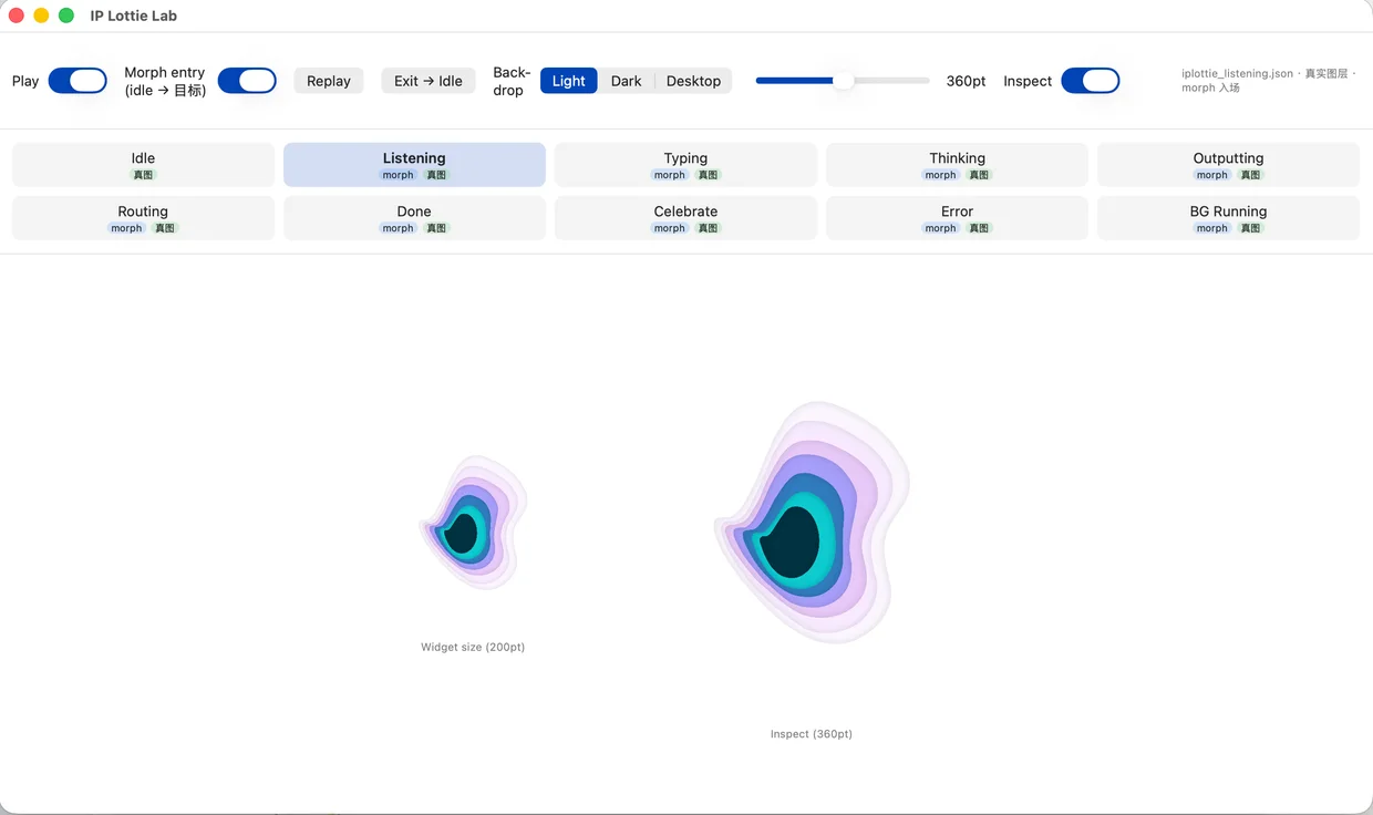
IP Lottie Lab: ten states, two transition segments, three backgrounds, size adjustment, and reverse exit playback.
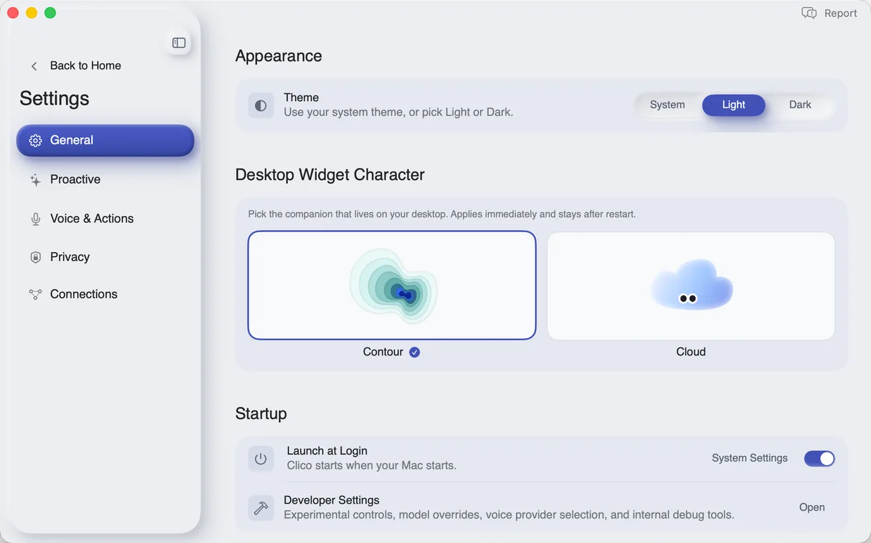
From developer control to user feature: character selection cards with a five-second preview loop.
Default Cloud · Ghost · FreeHand Cloud · FreeHand Cube · Glass Cube · MrBean · Contour… Select to apply. No Save button. Persists across restarts.
IP Lottie Lab in action: selecting a state plays its transition, then its loop.
Six onboarding iterations and an AI-powered animation pipeline
I led six iterations of first-launch onboarding and submitted the code for three. One iteration produced a reusable AI animation workflow; another produced 435 lines of SwiftUI that respect reduced-motion preferences.
In April, onboarding was three tutorial videos. By late May, it had become a three-step flow with an AI-generated 3D animation for each step. I built a four-stage pipeline from narrative and storyboards to keyframes and video. It powered the animations that followed. In early June, I built Homing Path, a glowing arc from the character to the notch that teaches users where to tuck it away. The starting point is calculated from wherever the character has been dragged. Bézier control points update with the start and end positions, producing a smooth arc from anywhere on the desktop. That makes the animation feel aware of the character's location. With reduced motion enabled, it becomes a static glowing path. The later “Poke me!” cue, July's interactive prototype, and August's character-selection step followed the same direction: turn instruction into product behavior and lead users into the real homepage.
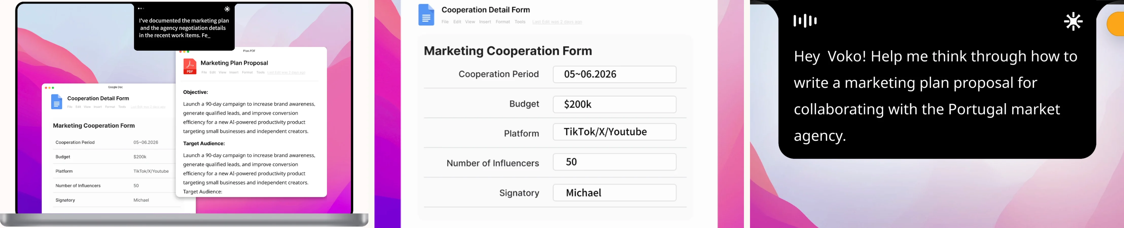
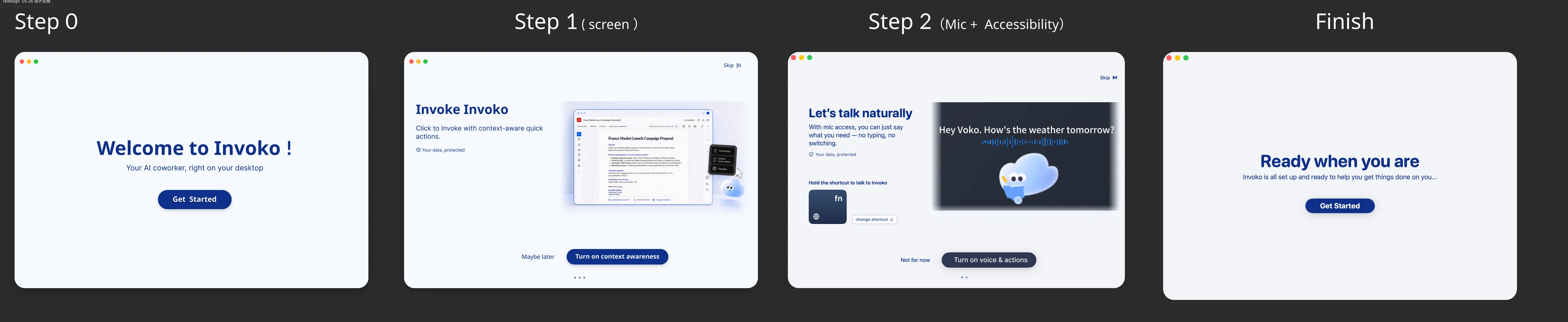
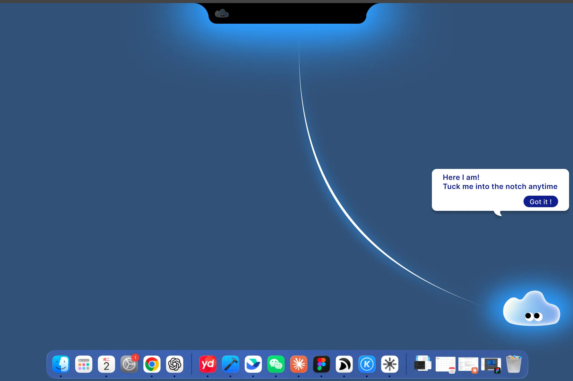
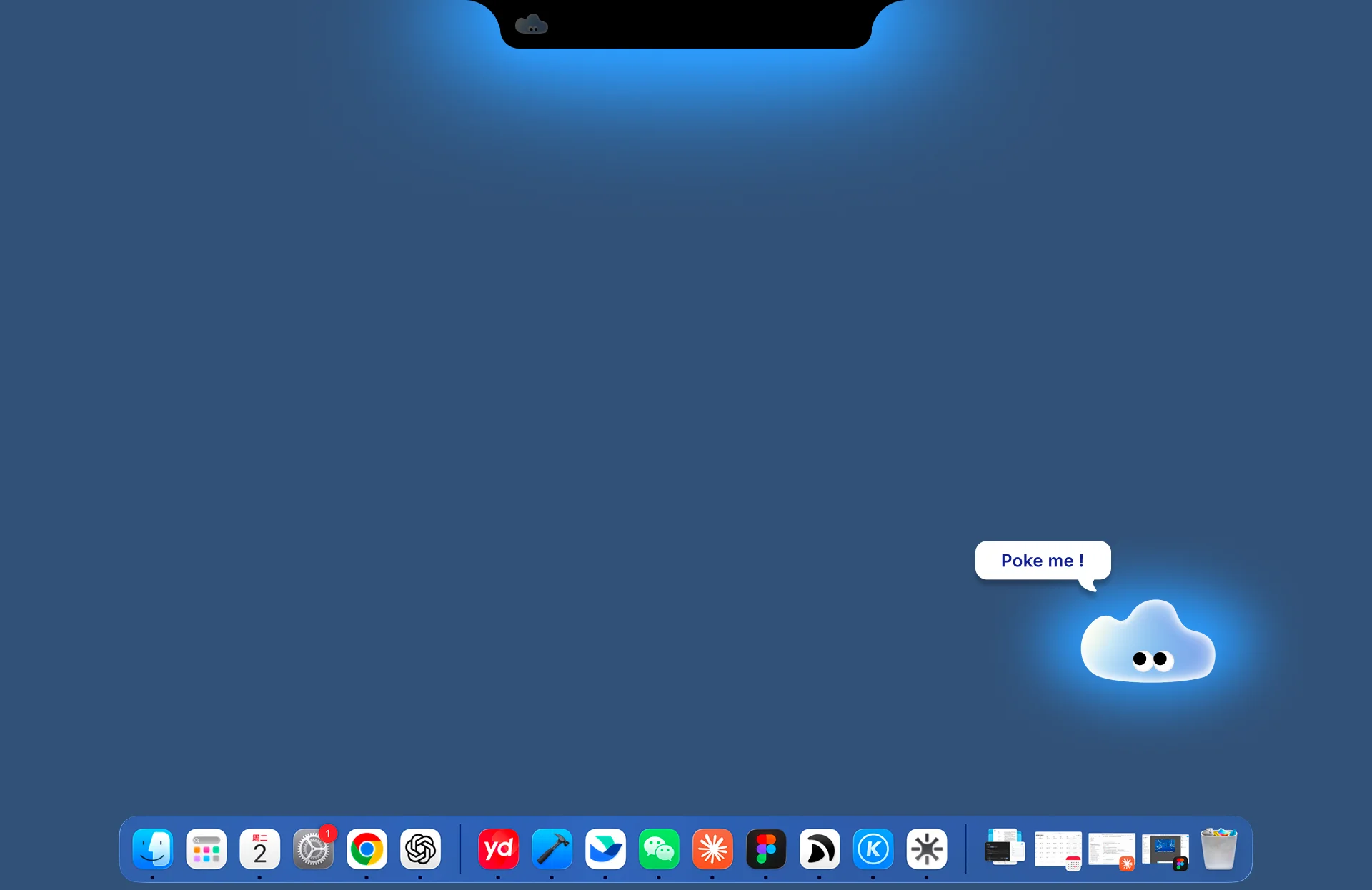
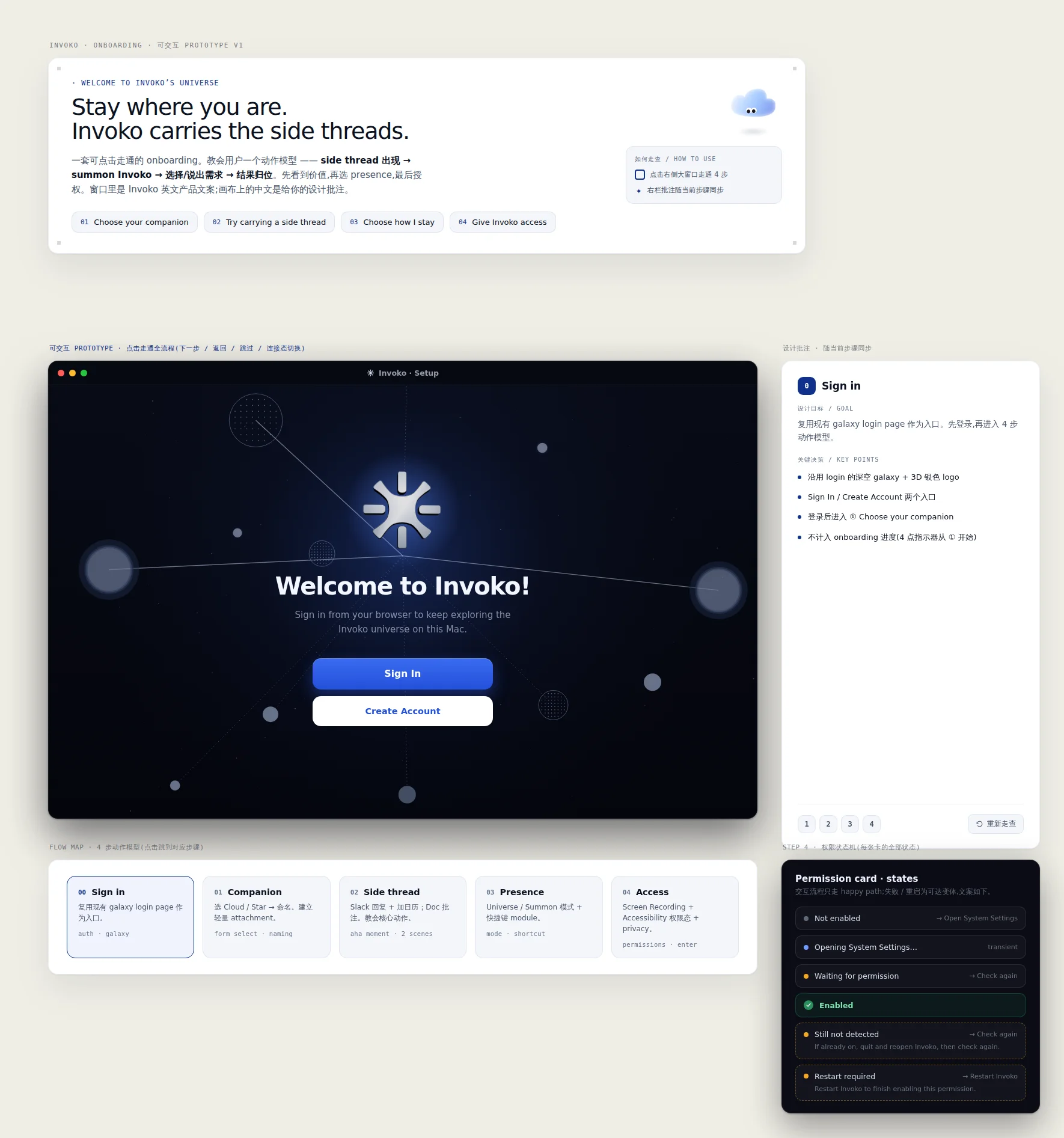
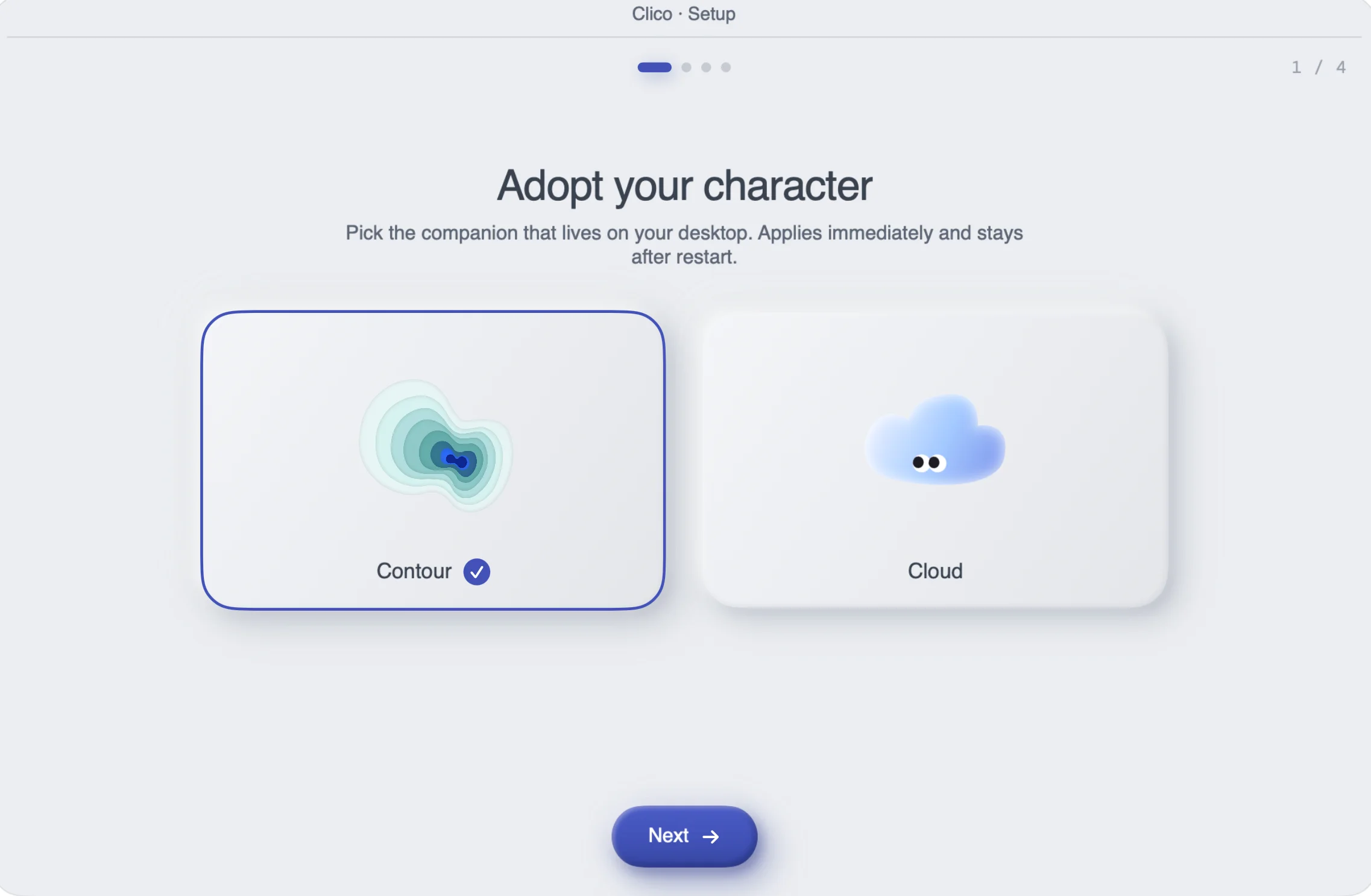
I led all six onboarding iterations and submitted the implementation for iterations 3, 4, and 6.
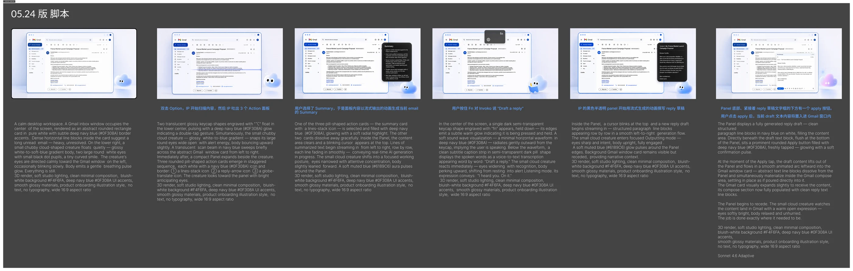
May 24 workflow: a style-locked prompt, candidate frames, and one selected keyframe for each shot.
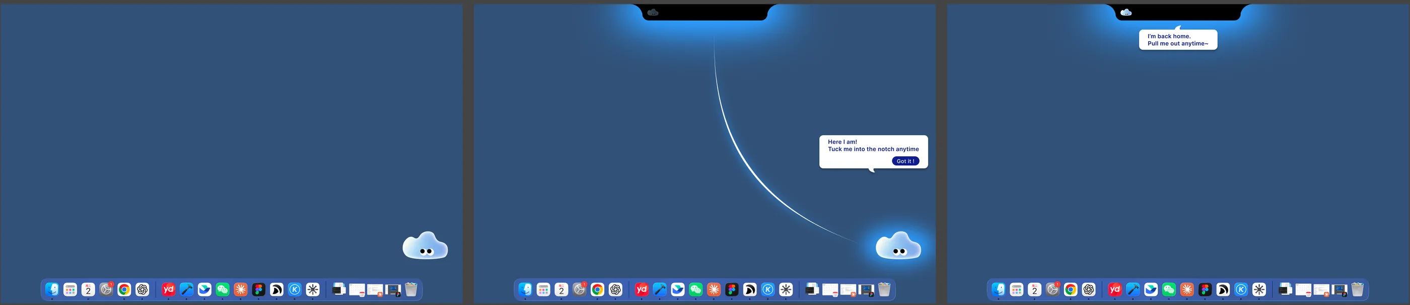
Homing Path design. The arc starts at the character's live position; this shows one possible placement.
The brand layer: three design systems, logo v9, and four concept films
The design system evolved alongside the code. The logo moved from seven AI proposals to a hand-drawn double-C vector. Four concept films used the same animation pipeline. I handled scripting, storyboarding, generation, voiceover, and editing for a 79-second final film. After scripting, execution took just half a working day.
The design system grew out of the code. Instead of starting with a moodboard, I extracted five visual principles from the client's actual theme implementation and built the rules around them.
The logo took four rounds: seven AI proposals, three directions I combined from them, and finally a hand-drawn double C traced into vectors.
The film scaled up the animation pipeline. An 18-shot script became an 11-shot, 60% cut when a two-week schedule was suddenly compressed into a next-day release. Each shot had a moodboard, camera direction, generation instructions, narration, and editing notes. I brought those fields together in a small web tool I built, the Script Screening Room, where I reviewed each shot. AI-generated footage and composited UI were combined with 11 voiceover segments into a subtitled 8K film.
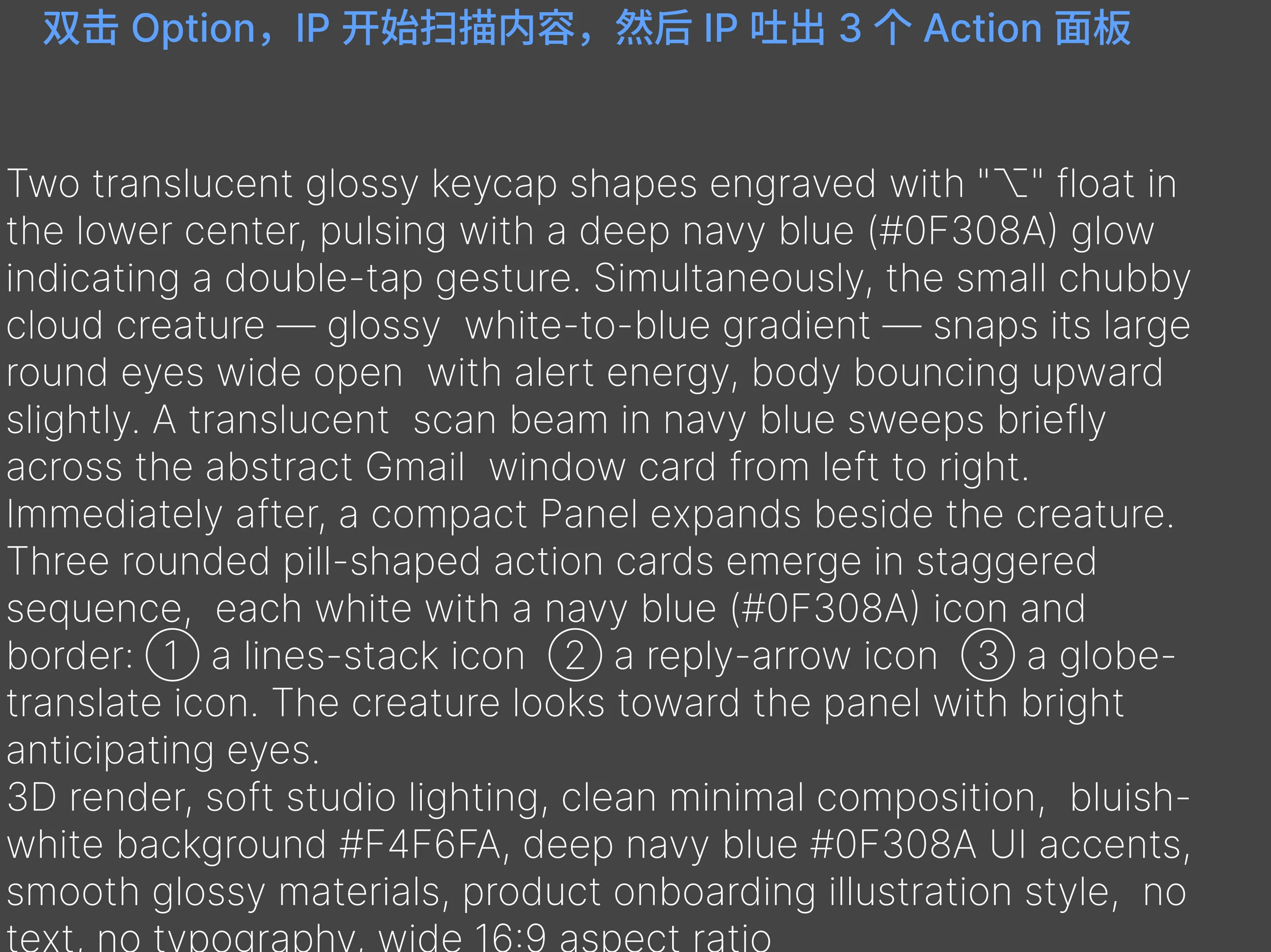
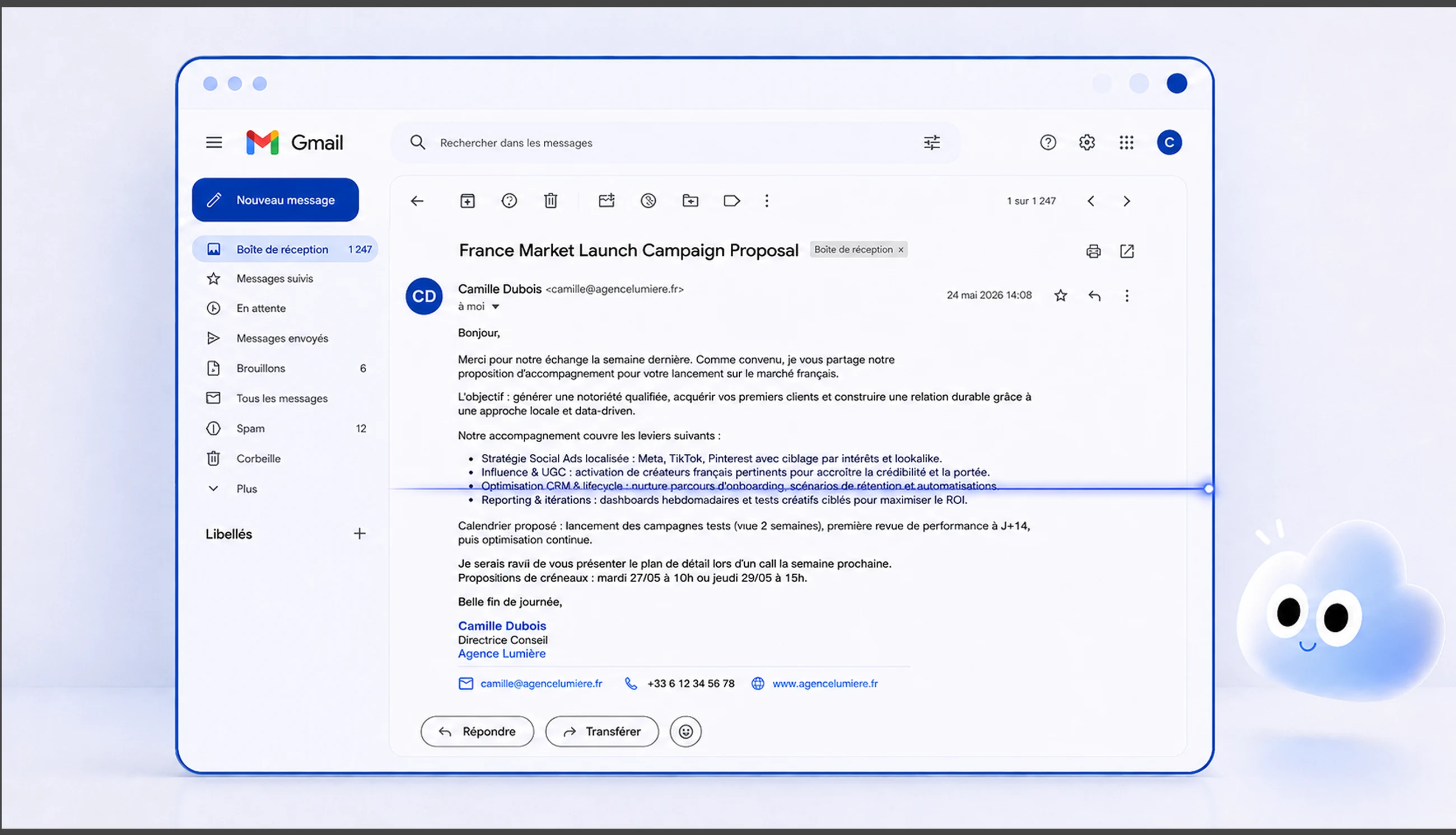
One shot through three stages: storyboard card → keyframe → final film.
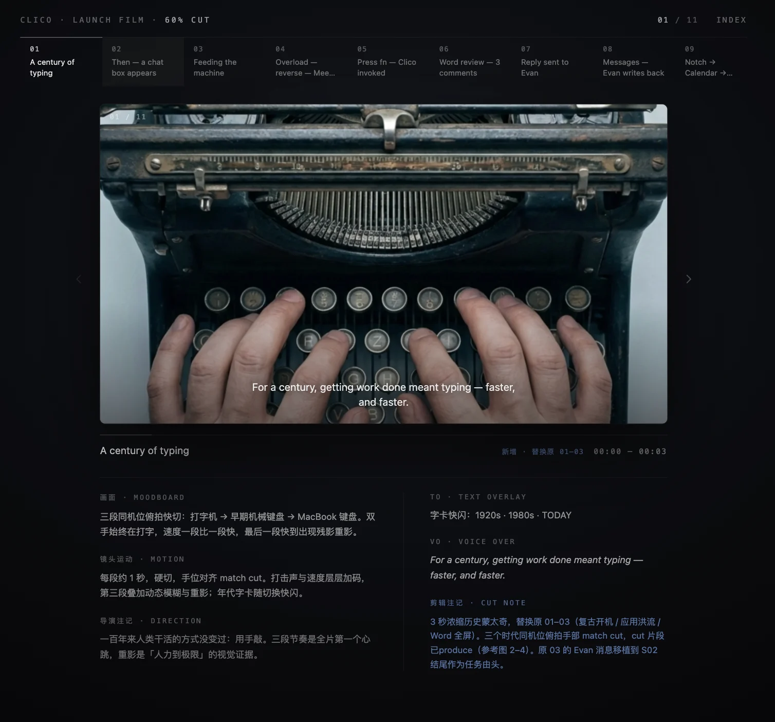
I built the Script Screening Room for this film: shot navigation at the top, the current keyframe in the center, and six fields below (visual, camera, direction, on-screen text, voiceover, and edit notes). Writing, review, and editing decisions happened on one page. This is where I cut the script down shot by shot.
Script → six-field storyboard → generation prompts → keyframes → voiceover → film and subtitles
Memory map: from moodboard to custom renderer to native client
Six days, four parallel AI sessions, four pull requests. I gave memory a spatial metaphor, wrote the renderer, and defined a synchronization workflow to ship it in the client.
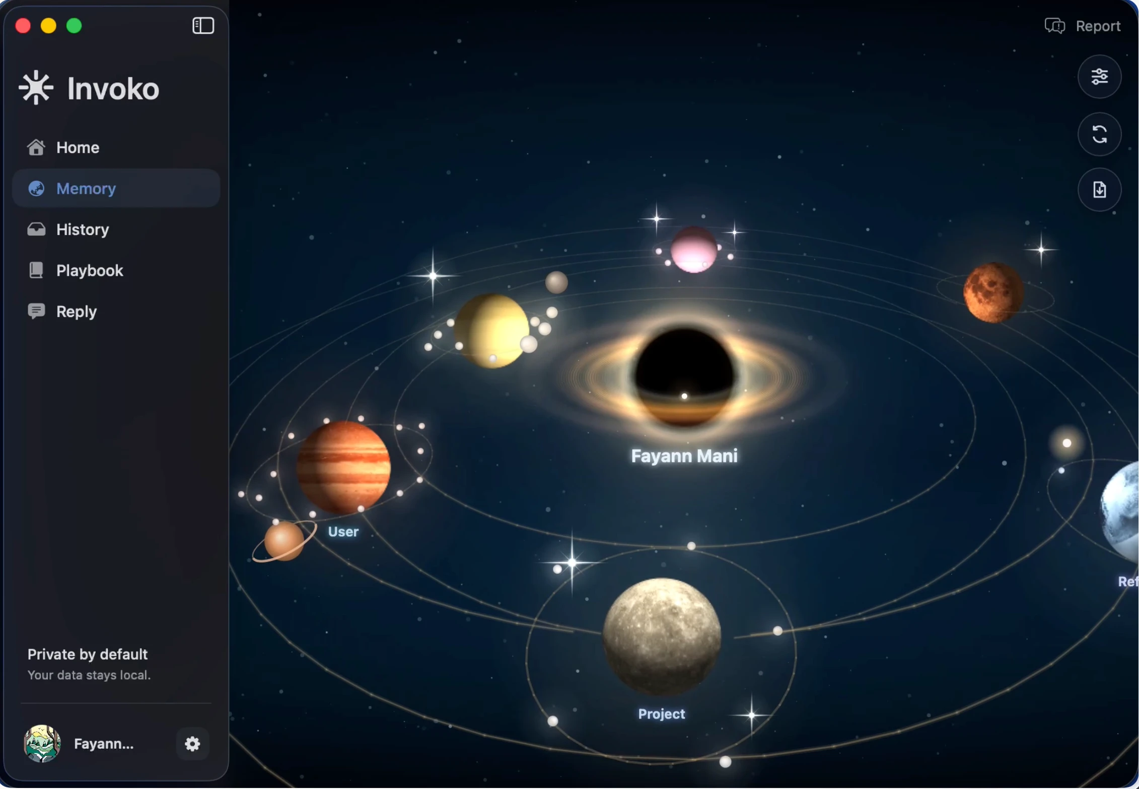
The Memory page needed to invite people back. I defined the metaphor first: the user is the central star, and each memory category is an orbiting planet. Those category planets are what shipped. I then wrote a pseudo-3D renderer in Canvas 2D: perspective projection, depth sorting, procedural planet surfaces, and particle rings, in more than 2,000 lines running inside a WebView. Visual review was numerical: orbit thickness changes from 2 px at 0° to 6 px at 180°, four-point stars have four rays, planets behind the central body must be occluded, and light always comes from the parent star.
Because the client loads this script as an embedded string, I defined a synchronization workflow: refine on the web, mirror into Swift, type-check, then verify in Xcode. I assigned four AI sessions: one for synchronization and Git, two for web implementation, and one for visual design. Six days later, the memory map was merged into main.
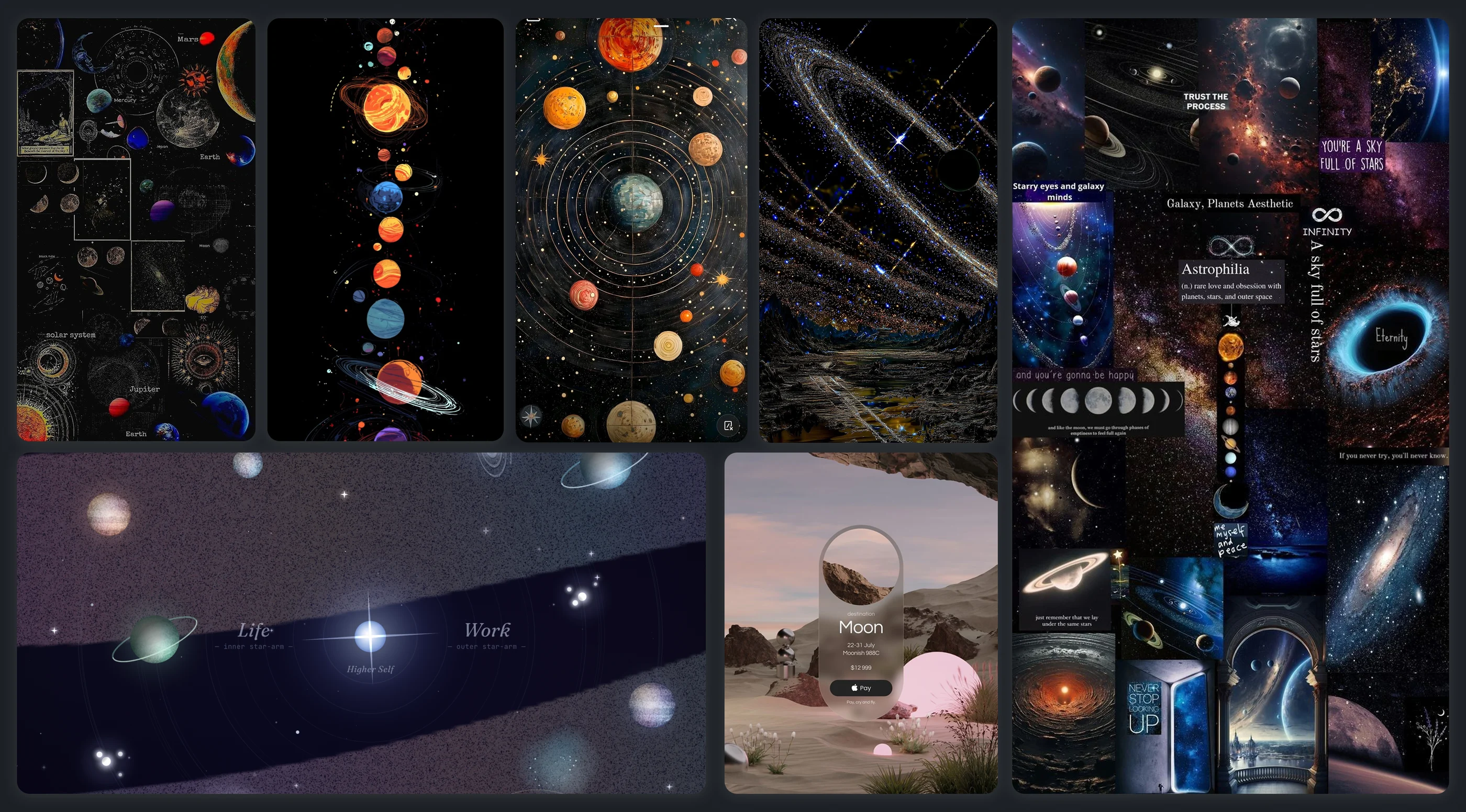
Meaning before pixels: the space moodboard I established before writing the renderer.
Drag, scroll, or select a planet.
The Memory map in the native app.

The Galaxy login screen, built in SwiftUI and SceneKit with a handoff package, applies the same visual language elsewhere.
Three system-level changes, all merged into production
This work went beyond proposals. It shipped in three major production releases.
The timeline below shows those three changes. Over six months: 40+ pull requests, 110+ commits, and more than 26,000 added lines of code. I merged 17 pull requests myself. The team treated design-to-code as a regular delivery path, not an experimental branch.
My most detailed handoff was the Daily Rewind design-to-engineering specification. Beyond three card variants, I defined ten modules, one input schema, and a complete behavior contract for the LLM. Client code owns layout and statistics. The model fills only six text fields in strict JSON. Facts must come from the input. Output is schema-validated, retried once on failure, then replaced with template copy if necessary. Results are cached by content fingerprint. Design defines what the model says and how failure is handled, as well as what the interface looks like.
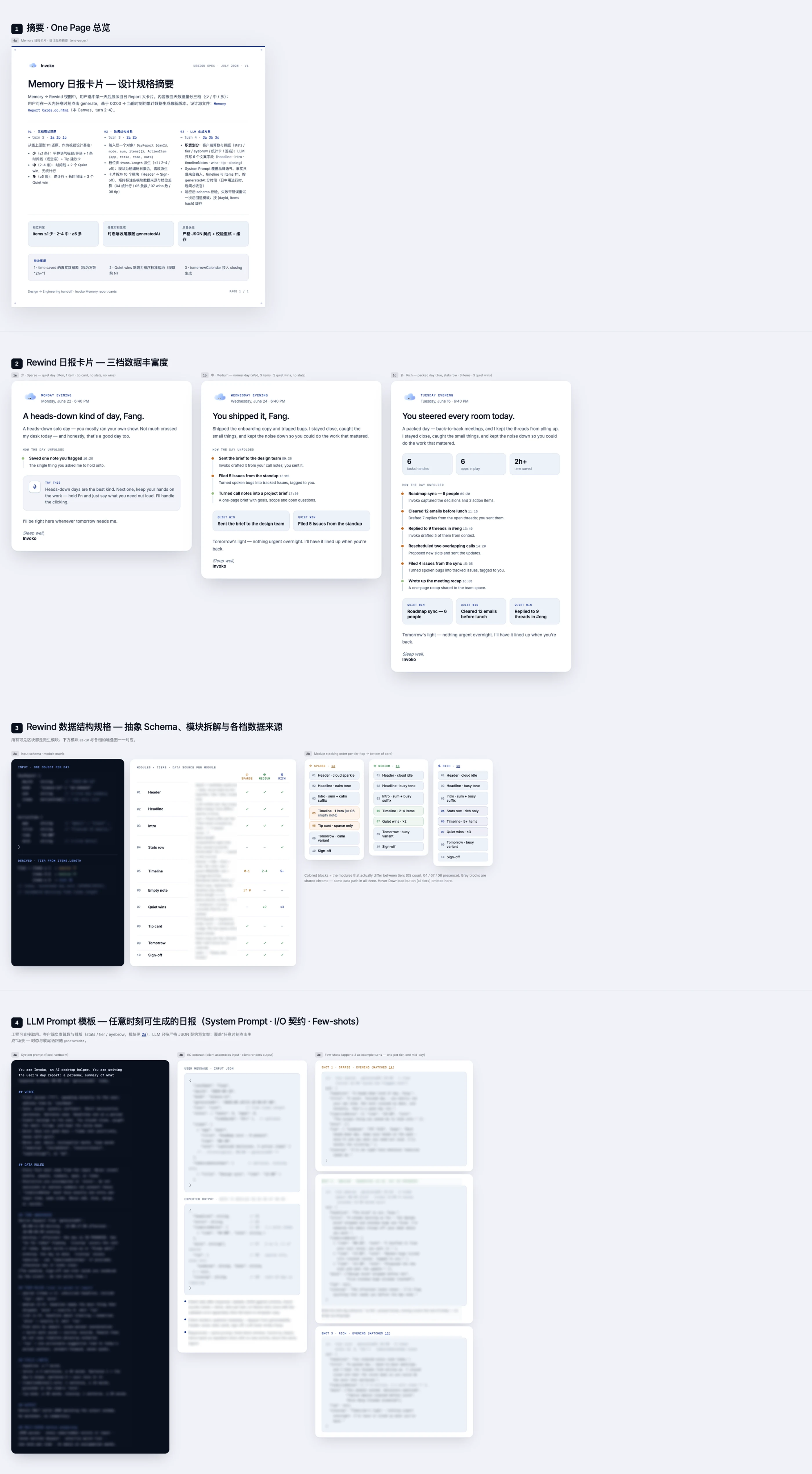
The Daily Rewind handoff: card baselines, data structures, and an LLM behavior contract, ready for engineering to implement.
Another foundational change in the same period: separating typography tokens.