OKEight — A Floating Quick-Reply Panel
Joined a live product and rebuilt its design system, brand, homepage, navigation, and core panel in six weeks, then merged the implementation into production.
About the project
OKEight is a quick-reply desktop app. Double-tap a shortcut to open a draft panel above any text field, browse suggestions, insert a reply, or ask for a natural-language revision that remembers your preferences. It began as an engineer's side project. As features and early users grew, it needed someone to own the experience. I joined as its only designer. The service had to stay live and familiar interactions had to remain intact, while its frosted-glass visual language could no longer accommodate new features.
I was the product's only designer and the main contributor to its visual implementation over six weeks. I used the same workflow as Clico: finalize in Claude Design, implement with Claude Code, review in the native app, then merge. Eleven pull requests and more than 12,000 added lines of code shipped, with many merged by me.
What we did
Set the rules before designing the screens. My first week focused on the design system: three core rules, five shadow layers, and token discipline. Everything built over the next six weeks grew from that foundation.
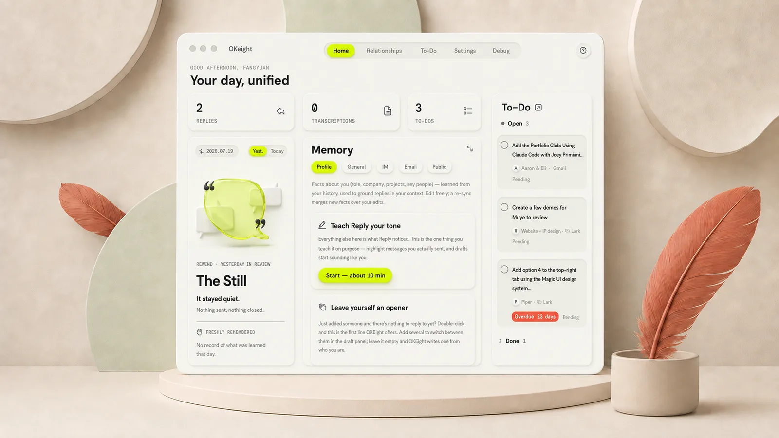
Frosted glass or clay? The live app used fashionable frosted glass. After taking ten visual directions down to the component level, I chose Soft Clay: matte clay surfaces with one high-energy lime accent.
Workplace humor or literal MBTI labels? The sixteen-personality universe uses Chinese and American workplace humor rather than literal MBTI terminology. The shareable content should make people smile before asking them to understand the taxonomy.
Taking over: the product before and six weeks after
The hardest part of taking over a live product is deciding what must stay.
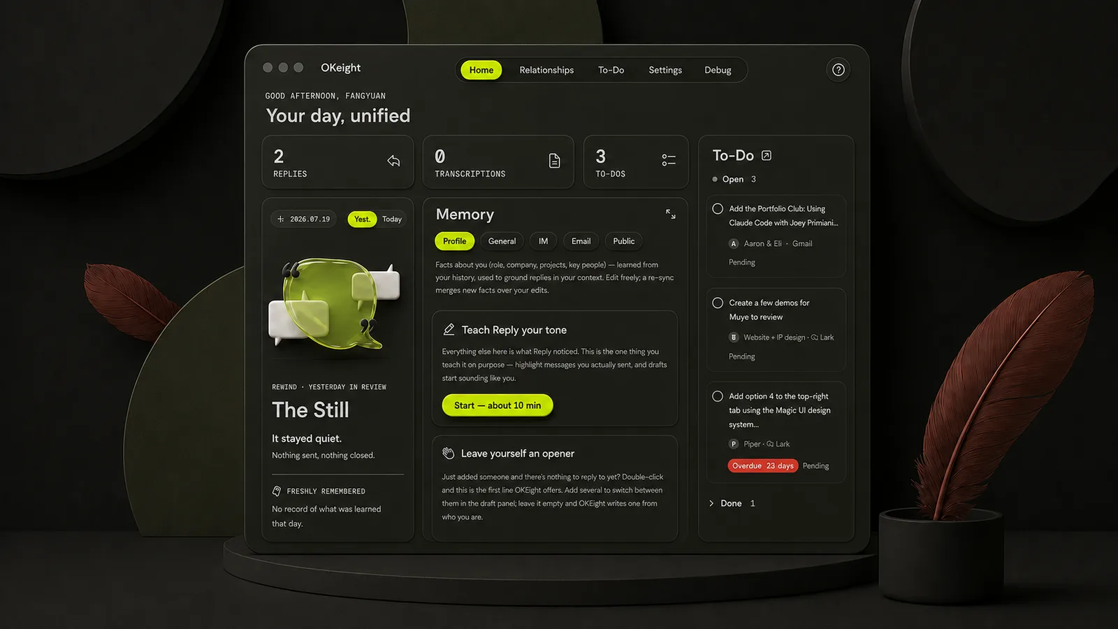
I joined OKEight in mid-July 2026 and took ownership of design. Existing habits were product assets: double-tap to invoke, browse cards, and insert text. Those stayed. The visual language had to change. As features accumulated, frosted-glass panels no longer offered enough hierarchy or room for the brand. Six weeks later, the same client had a matte-clay homepage backed by a complete design system.
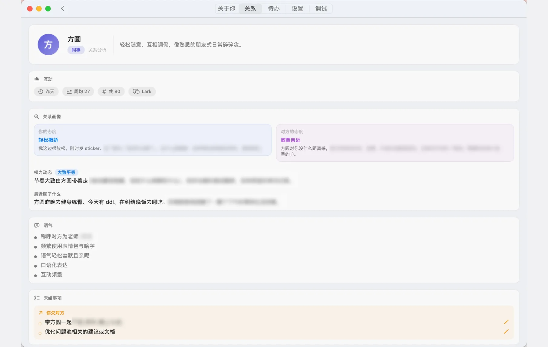
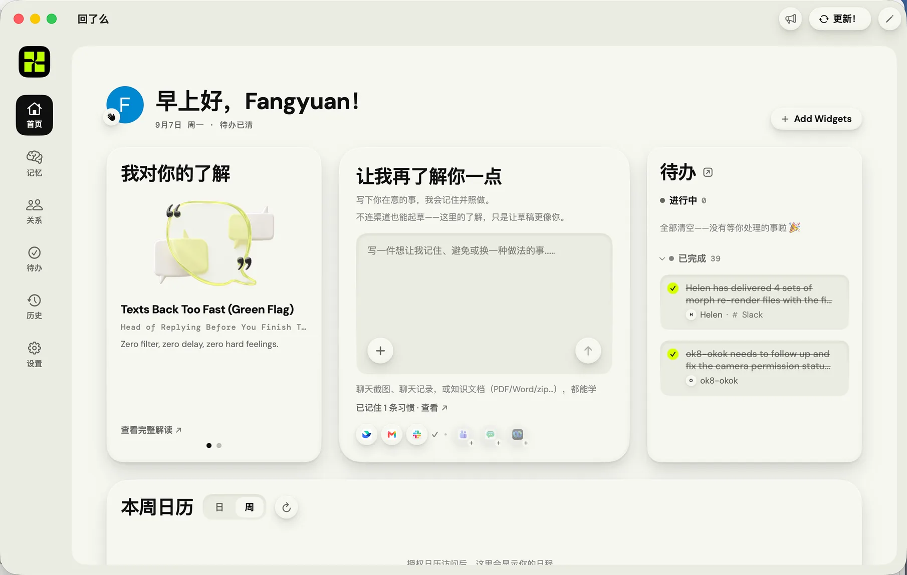
Left: when I joined. Right: six weeks later. A complete design system sits between them.

Define the rules first: Soft Clay × Volt
I evaluated ten visual directions at the component level over ten days before choosing Soft Clay × Volt and formalizing its rules.
I started a week before joining. Using real client screenshots, I asked AI to explore three open-source design systems, then created my own comparison direction.
On my second day, I triedacross the interface. That same week, I built a strategy board with ten styles and assessed which could survive beyond posters at the component level. Three directions remained.
Within 24 hours, I chose Soft Clay × Volt: matte clay with a single high-energy lime accent. I then wrote the rules: three principles, five shadow layers, SF Symbols only, and CSS-to-SwiftUI conversion tables, iterating from v1.1 to v1.3. The method eventually served two products. Clico's design system was its second application.

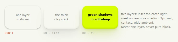
One card per rule, written so each decision can be checked.
The system contains 24 specification cards, 18 components, and a five-page UI kit. Clico applies the same method; see its case study.
Three panel redesigns, ending in a nine-skin testing Lab
For the core component, I delivered a working Lab with nine skins. Decisions happened in the actual interface, not on a presentation slide.
The floating panel is the face of the product. First, I explored three directions beyond frosted glass: branded double edges, elevated glass, and Clay Instrument. We selected Clay Instrument.
Next, I explored footer variants beneath it. The paper-base version shipped.
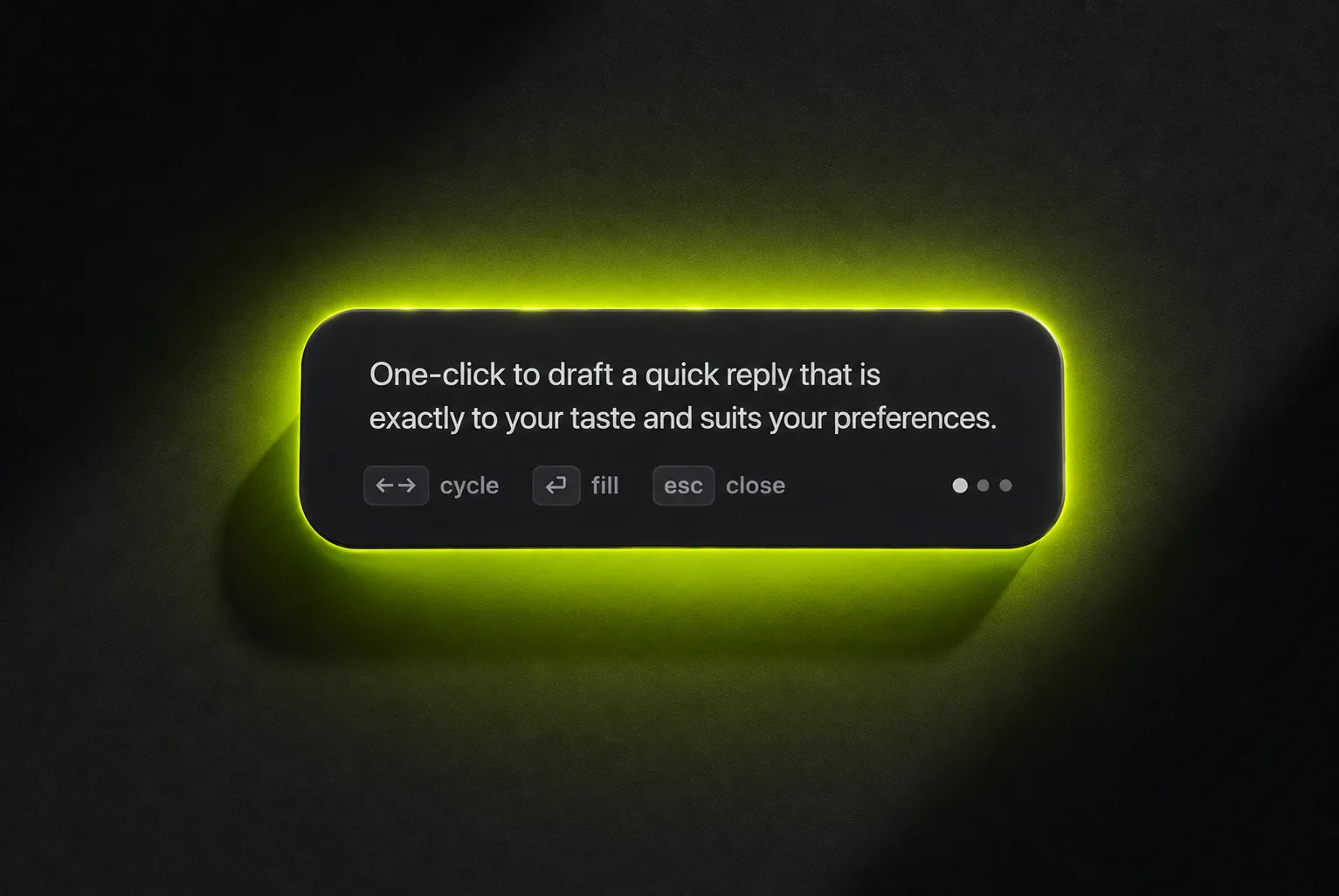
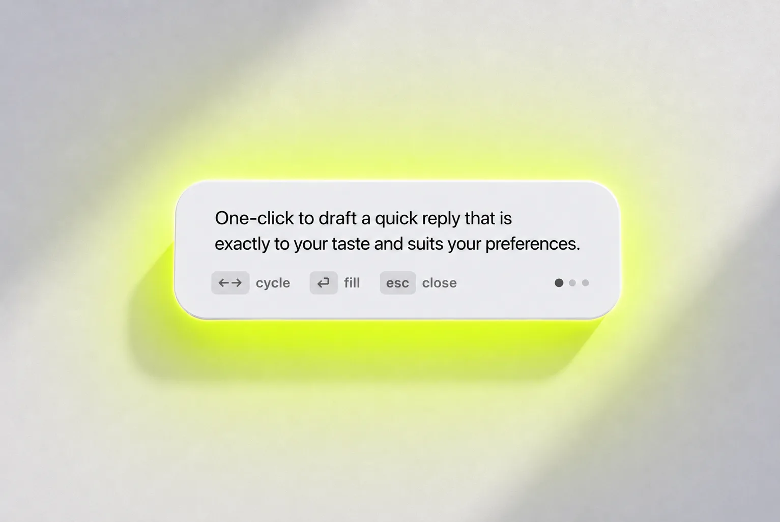
After launch, I opened a new exploration without the existing system as a constraint, starting again from material and lighting. In less than a day, I narrowed it to nine skins. These were interactive options in one Design Lab, comparing grain, frosting, contrasting colors, and fluorescent accents on the same panel.
Try switching between them below.

This is the tool I used to make the design decisions. Try switching the wallpapers.
Reply16: a personality universe for reply styles
A complete brand mechanism: four binary axes, sixteen reply personalities, sixteen clay characters, and share cards and posters in Chinese and English. I wrote the typology and copy; AI rendered the characters to my specifications.
OKEight needed a typology, not a mascot. An engineer defined four binary axes: structure, force, expression, and density. I built on that framework, naming the sixteen combinations through Chinese and American workplace humor and organizing them into four color families. Each type has a Chinese badge title, a LinkedIn-style English badge, and three traits. The names are culturally adapted rather than literal MBTI translations.
I defined the visual language: head-to-body proportions, personality, and the tactile 3D clay finish, then used AI to generate all sixteen character designs. Poster typography rules evolved to v3.1, specifying details such as keeping each trait on one line by adjusting type size. The result became a sharing mechanism: after taking the test, a card announces your online communication personality.
The framework: four axes, each with two choices.
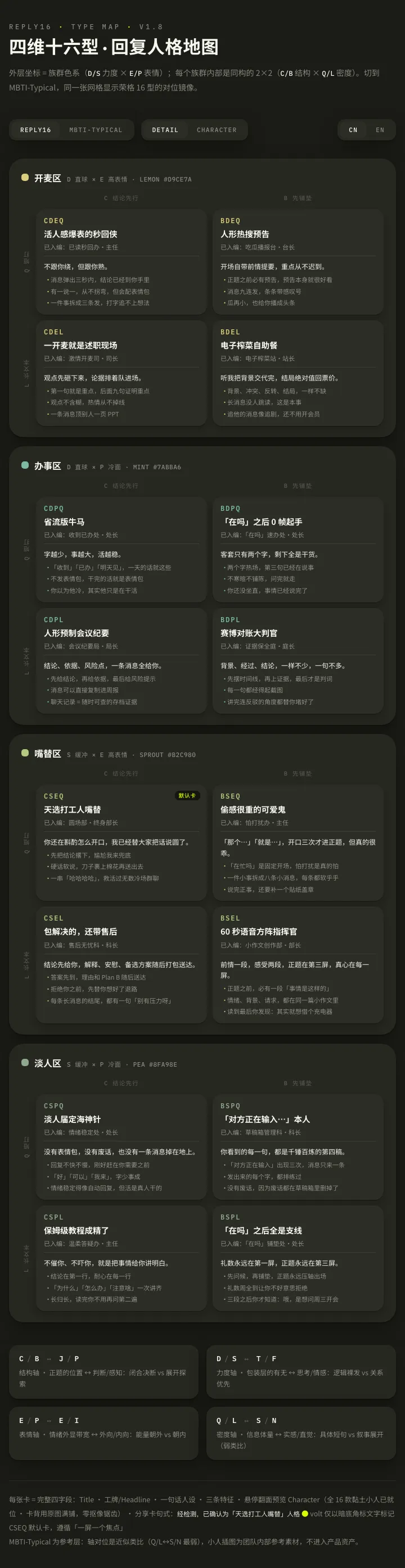
Four binary axes, sixteen reply personalities. Select a card to flip it over.


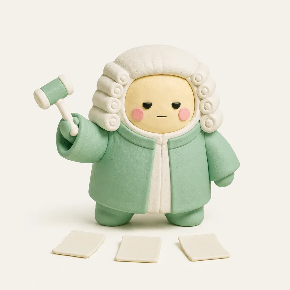




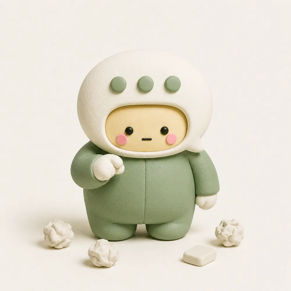


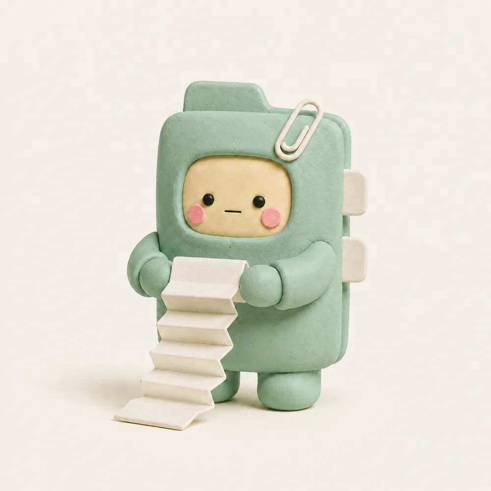
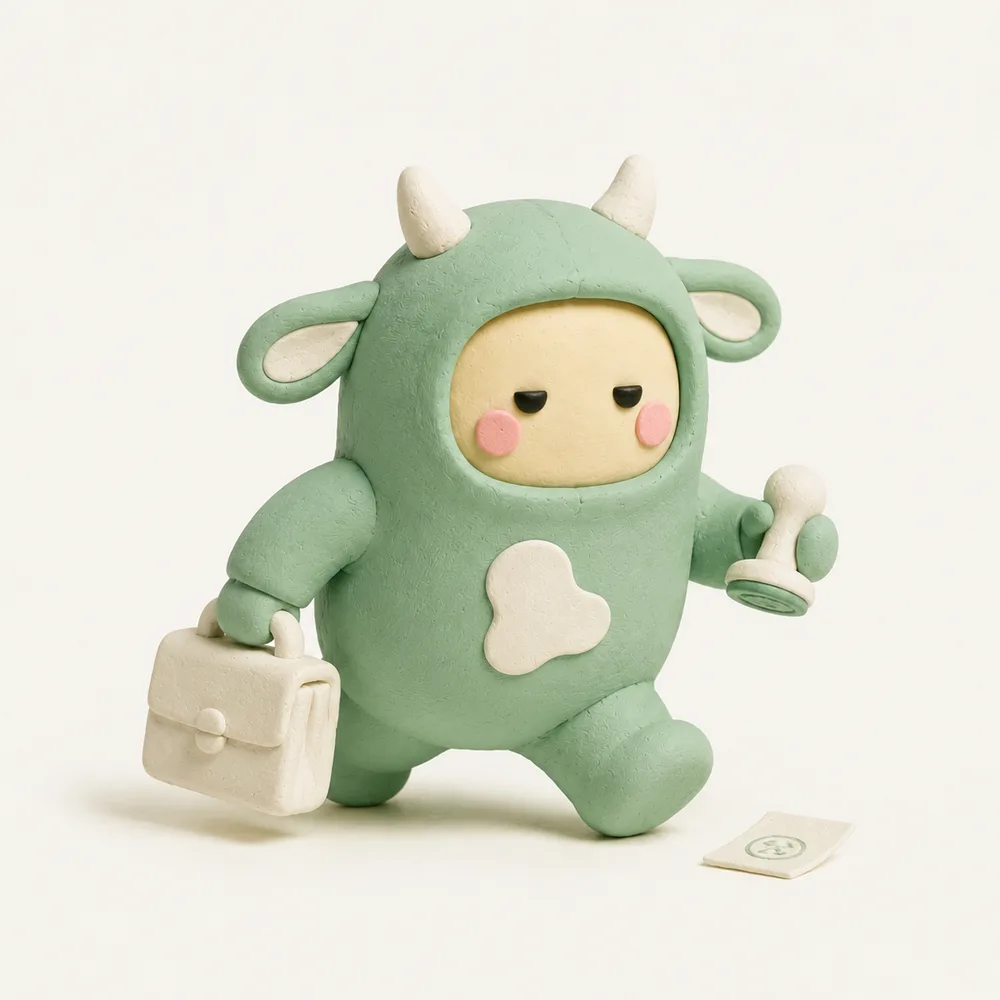

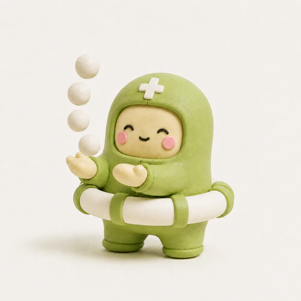


Sixteen characters with a shared face: making the typology tangible.

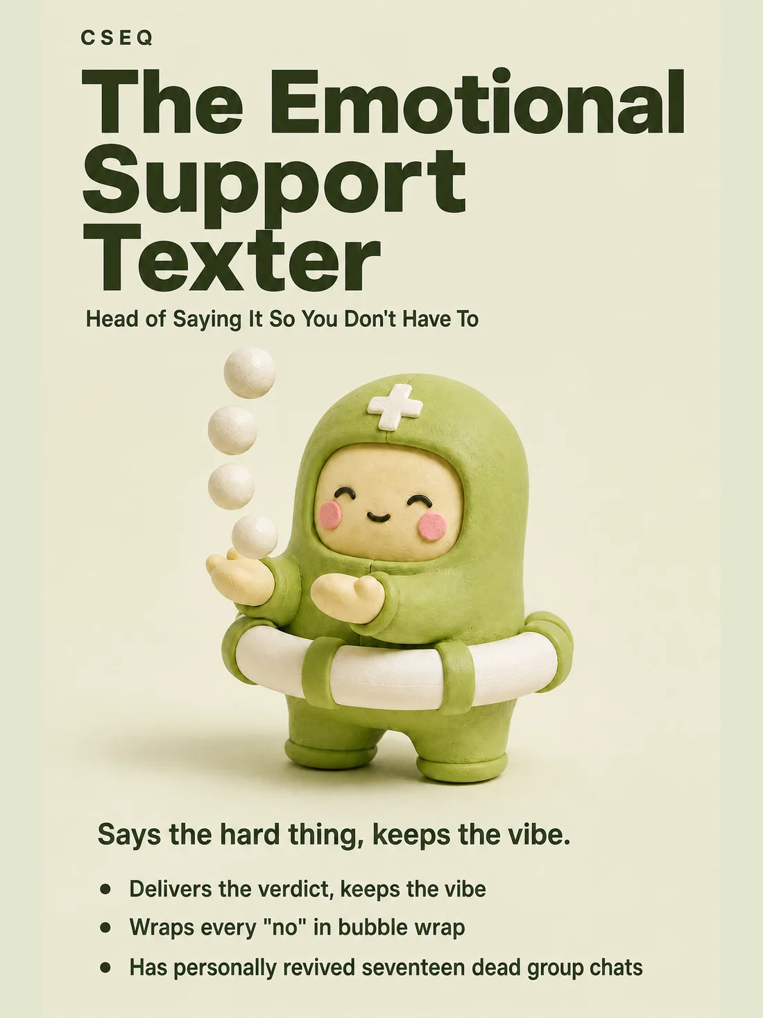
After the test, a share card introduces your type. The naming draws on Chinese and American workplace humor.
Homepage and navigation: reviewed from both sides, then shipped
Over six weeks, I both reviewed others' work and had my own reviewed. I gave twelve prioritized findings with fixes, responded to feedback item by item, and challenged some suggestions with reasons. The process ended with validation in the native app.
As reviewer: I assessed a teammate's rapidly built homepage through product, UI, and interaction lenses, delivering twelve prioritized issues and fixes.
As reviewee: I responded to a leadership review of navigation and information architecture, implementing justified changes and explaining disagreements. We validated the outcome in a native-app demo.
The homepage, navigation, and review fixes all merged into main.