Karis — A Marketing Agent for Global Teams
From the MVP conversation model to pricing and brand, I was the only designer through two product name changes.
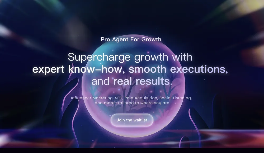
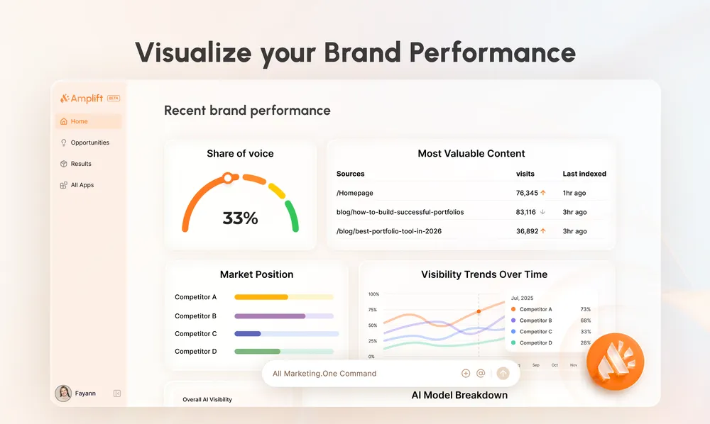
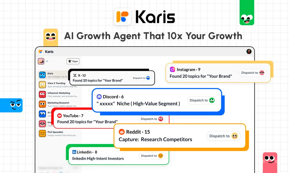
Three names, three personalities: the visual language of one product across three phases.
About the project
Karis is a web-based marketing agent for international markets. Users work with it like a specialist marketing team: describe a complex task to a lead agent, which coordinates expert agents to deliver it. When I joined, it was called SophiaPro. It later became Amplift, then Karis, evolving from a workflow tool into a chat-first product. There was no previous designer or existing asset library. I built the design foundation from day one.
As the sole designer and de facto product design lead, I owned the MVP, information architecture, pricing experience, and two rounds of brand and website redesign. Figma was my main canvas, with extensive use of Figma Make to explore directions and build interactive high-fidelity demos, including onboarding. Over six months, the work spanned 23 Figma files and 52 key artboards.
What we did
Chat-first or a tool menu? A marketing agent's value comes through conversation. Both structural shifts moved toward an assistant-first experience: let users describe the need, then let the system coordinate the work.
Making usage-based pricing understandable. Pricing means making credits visible, showing how they are consumed, and explaining how to replenish them. The business model has to become a usable product structure.
Why rebrand twice? Each name change reflected a sharper positioning. The brand and website evolved with it so that the product's outward identity matched what it had become.
MVP design: a four-stage conversation model
I defined how the agent communicates: clarify the need, plan, execute, then summarize. Every bubble, authorization interruption, and error state was specified.
In August 2025, the MVP began with the conversation model. A user describes a need; the agent turns it into clear requirements through a form with multiple choices and room for additional context.
It then presents a plan and executes step by step, showing tool calls, authorization requests, and retries on the canvas.
Finally, it summarizes the results and opens the deliverables on the right. This was an annotated specification, not just a set of screens: when bubbles appear, how reasoning streams and collapses, and how tool capsules distinguish in-progress from completed work.
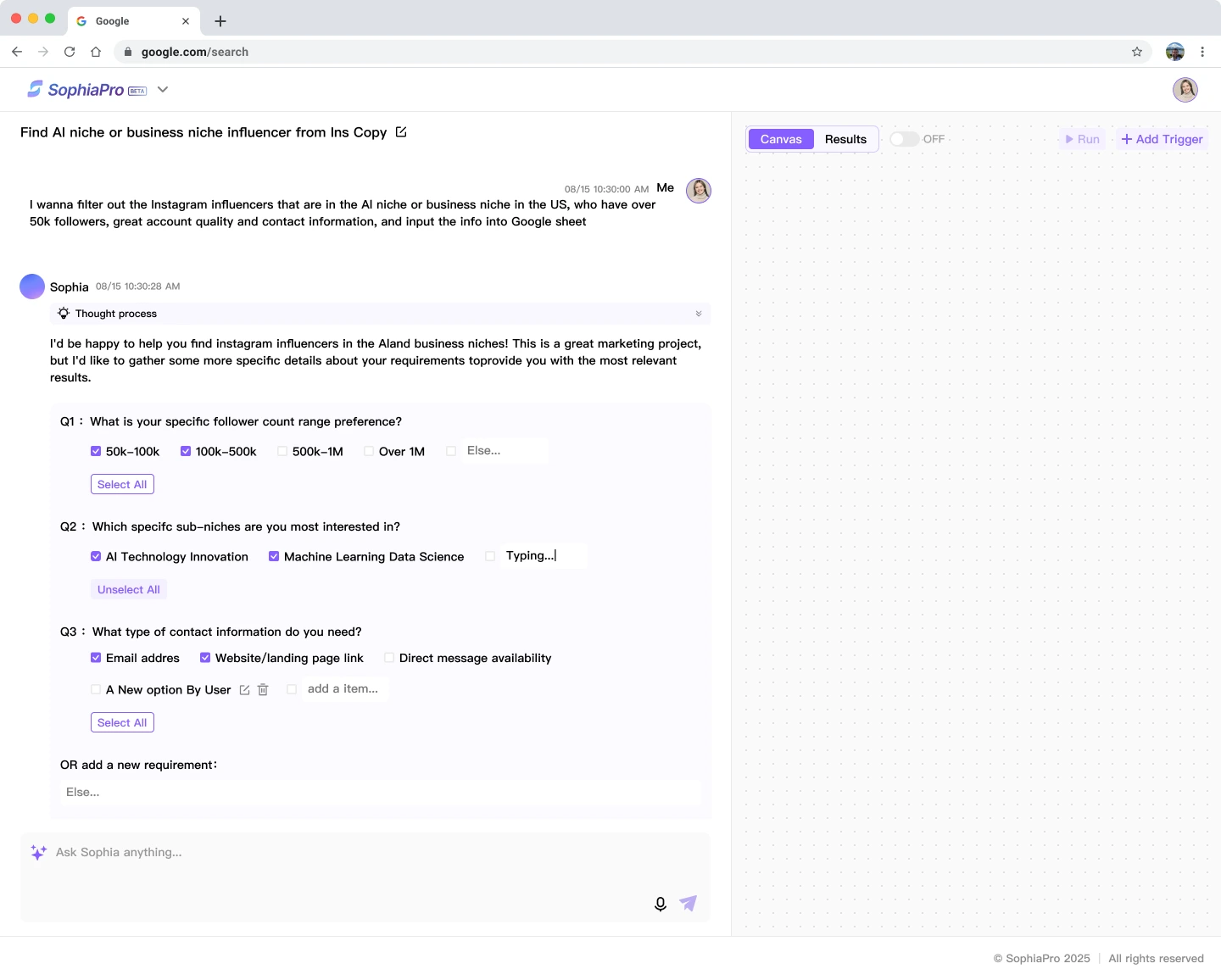
Stage one: requirements clarified in chat, with a canvas ready to develop.
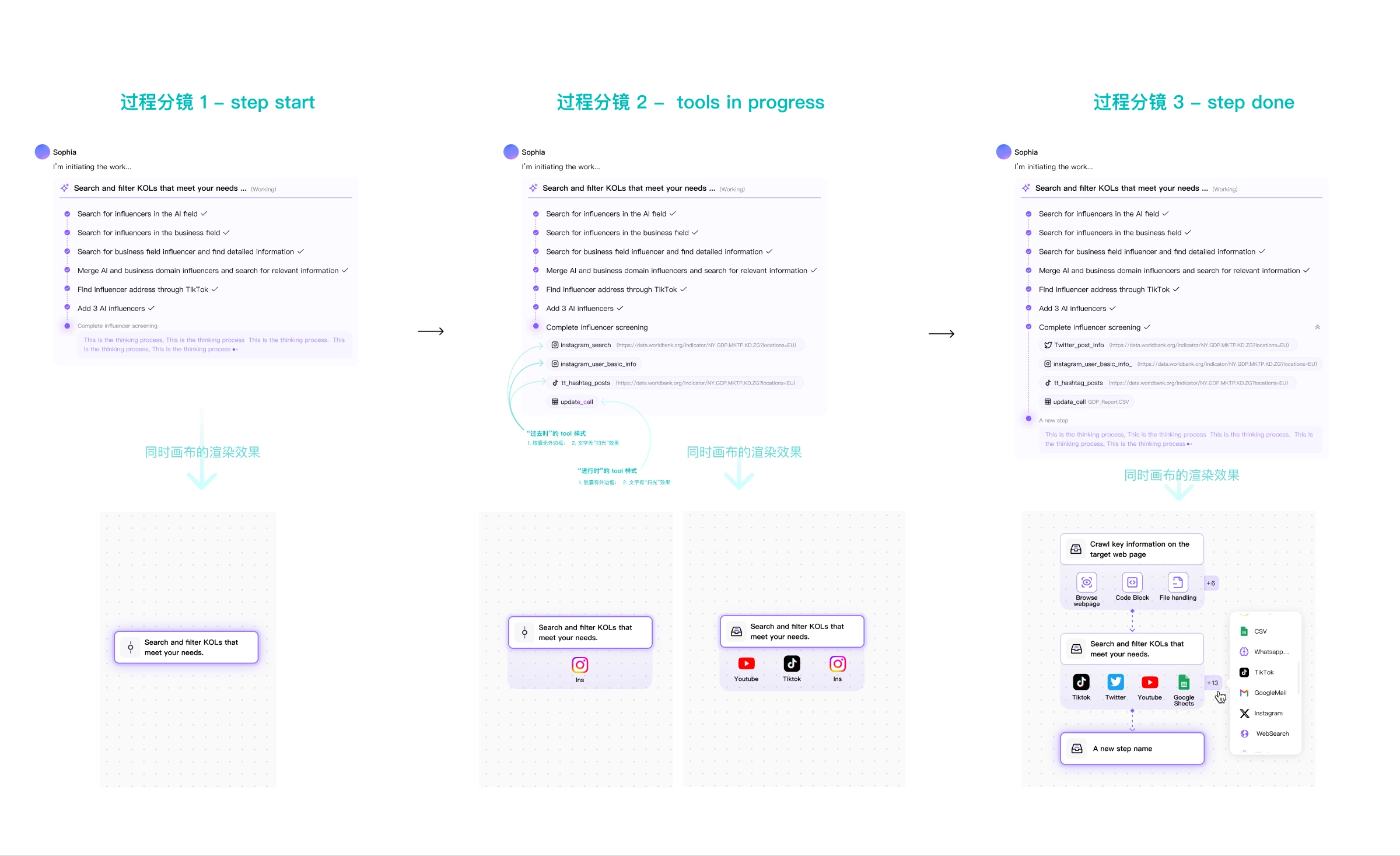
Chat-to-canvas mapping: each tool call creates an icon on its node.
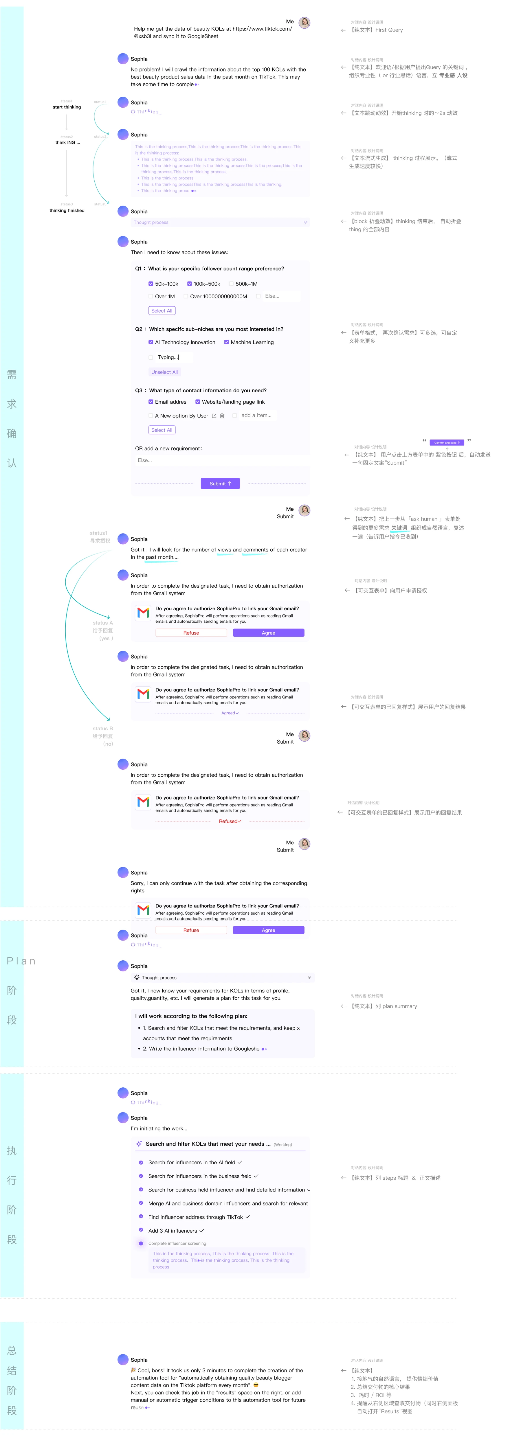
A single specification sheet documents every bubble, its trigger, and its motion across all four stages.

Pricing: translating the business model into an interface
I also contributed to the commercial model: usage tiers, entitlements, and metering, translated into an interface users could understand and manage.
For v0.5, I worked on the usage-based pricing structure and its product expression together. Where do users see credits? How are credits consumed during a task? How do users replenish them? Every step needed a clear place in the interface.
The pricing page is where users understand how the product charges for its work.
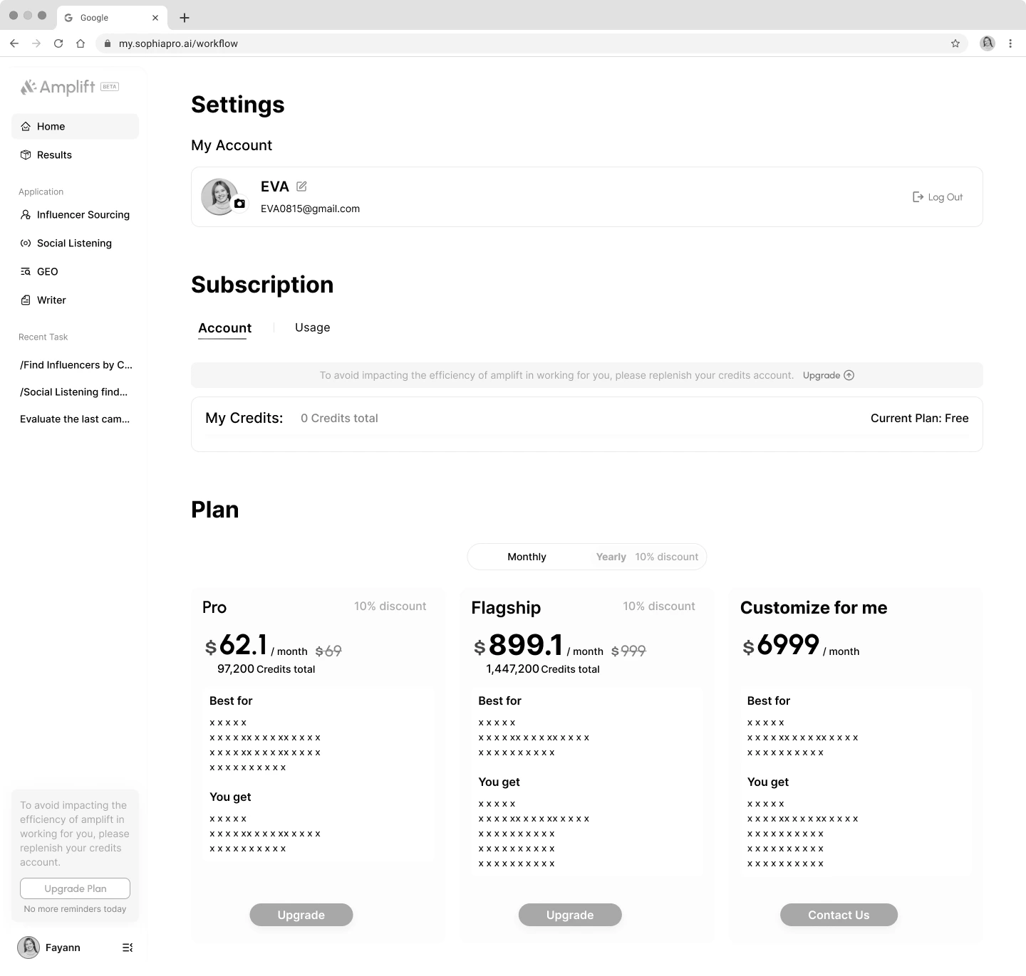
Usage-based pricing translated into the interface.
Two structural shifts: tool menu → opportunity hub → direct conversation
I drove two shifts in information architecture: from a tool menu to an opportunity hub, then to direct conversation with a marketing team.
First, from a tool menu to an opportunity hub. The original homepage presented separate tools and asked users to choose. The redesign surfaced marketing opportunities assembled from multiple tools. Users could scan the highest-value structured information and decide whether to act.
Second, from an opportunity hub to direct conversation with a marketing team. The interface became a Slack-like workspace with a lead and specialist agents. This redesign also introduced a customizable skin system with eight color palettes.
The product philosophy was to remove the burden of navigating a GUI. A marketing lead proactively brings useful information, and users describe what they want in plain language instead of searching for the right tool.
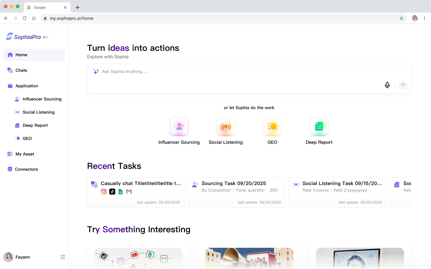
Every tool on the homepage; users choose where to start.
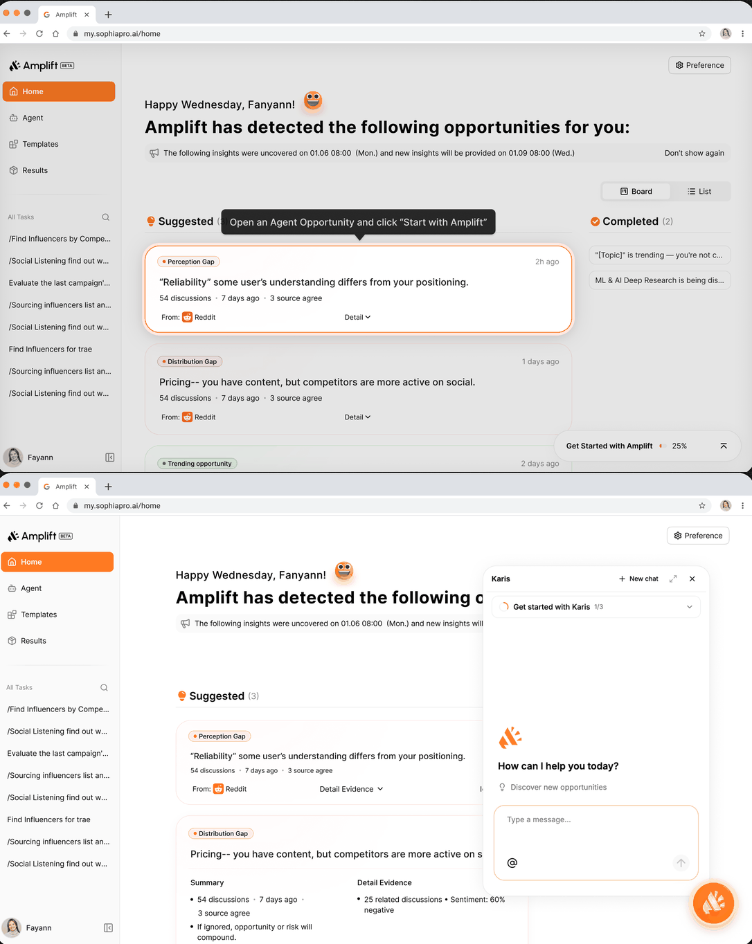
Put opportunities in front of users and move tools behind the scenes.
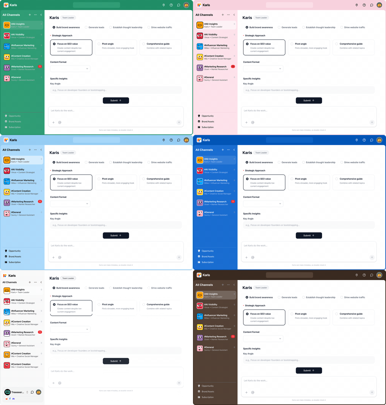
Describe the goal in plain language, without searching through tools.
Two rebrands and two website redesigns
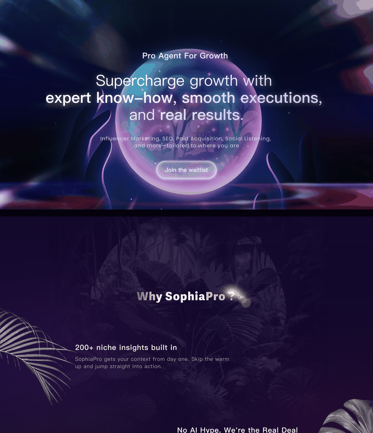
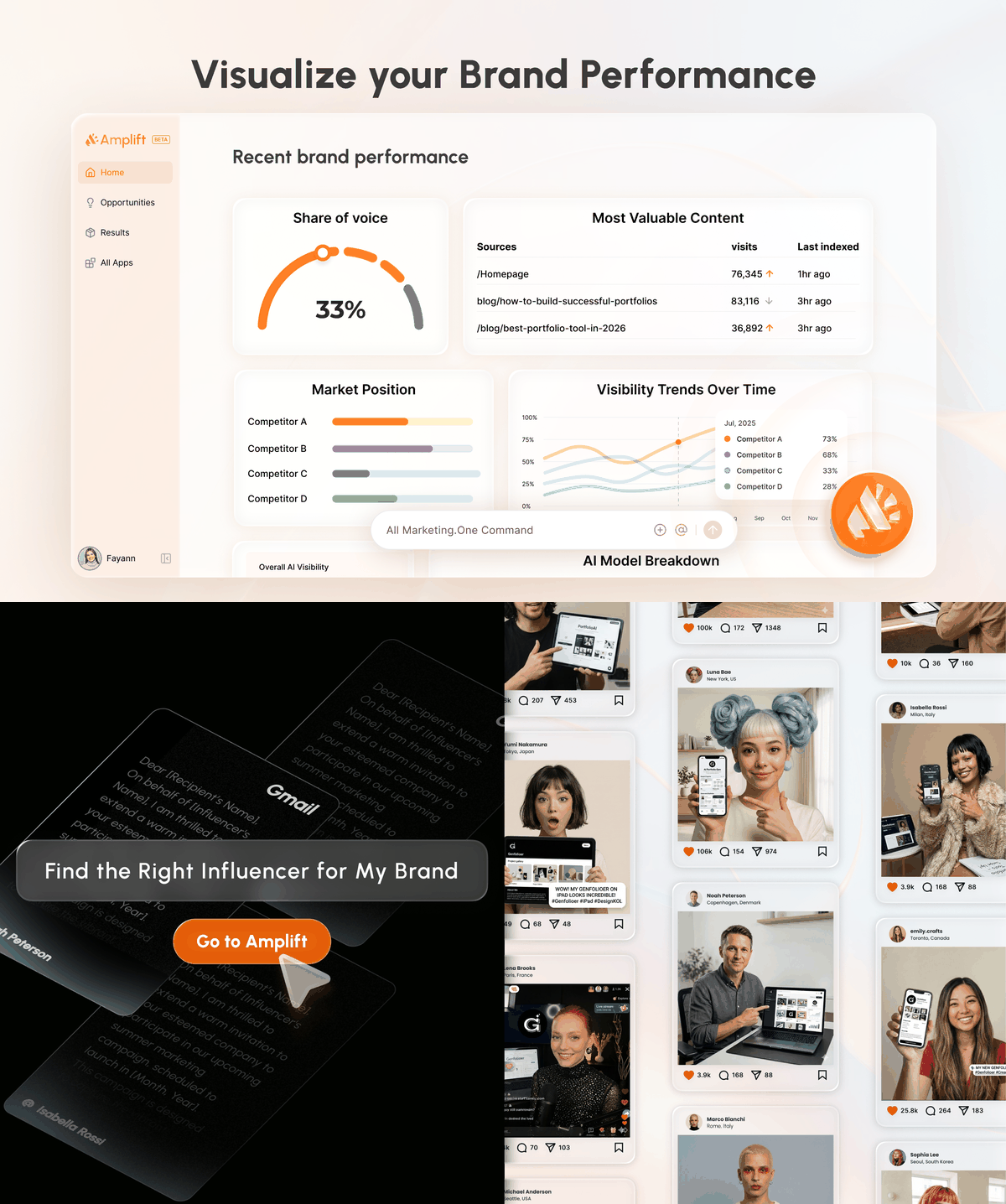
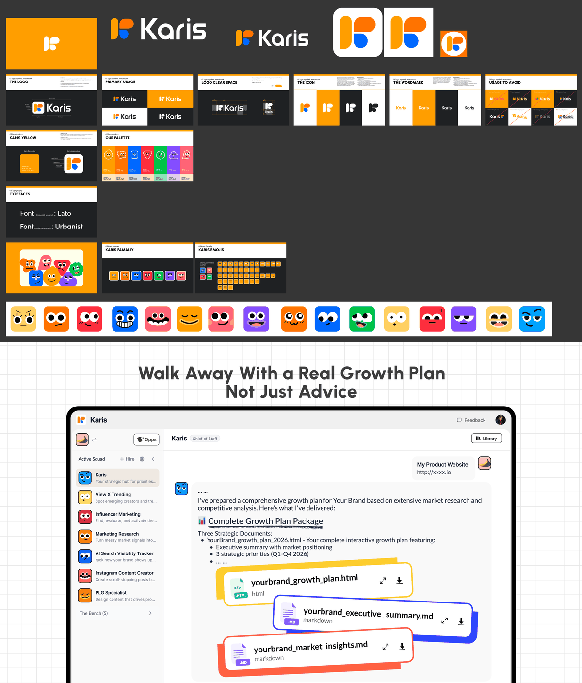
Across two product name changes, I redesigned the brand and website twice, from the logo to launch assets.
I created the first logo and website for SophiaPro. When it became Amplift, I rebuilt both. With Karis, I did it again. The visual identity converged twice over two months, alongside Product Hunt launch assets. I also designed the four-section karis.im website and its usage-based pricing presentation. Each change reflected sharper positioning; the identity needed to keep pace with the product.
Going deep: Social Listening and AEO
Complex B2B design lives in the details: creating monitoring groups, reading dashboards, and specifying the implementation.
Social Listening's monitoring groups came from a detailed comparison of leading competitors. I designed grouping and workspace data flows around a simple requirement: marketers need to check this every day.
AEO is a KPI dashboard. I organized metrics and trends, and included token annotations around the artboard so the design arrived with implementation guidance.
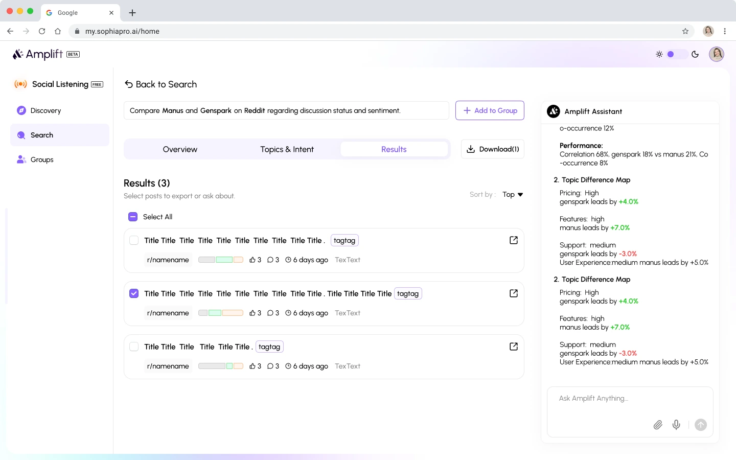
A monitoring workspace structured for daily use.
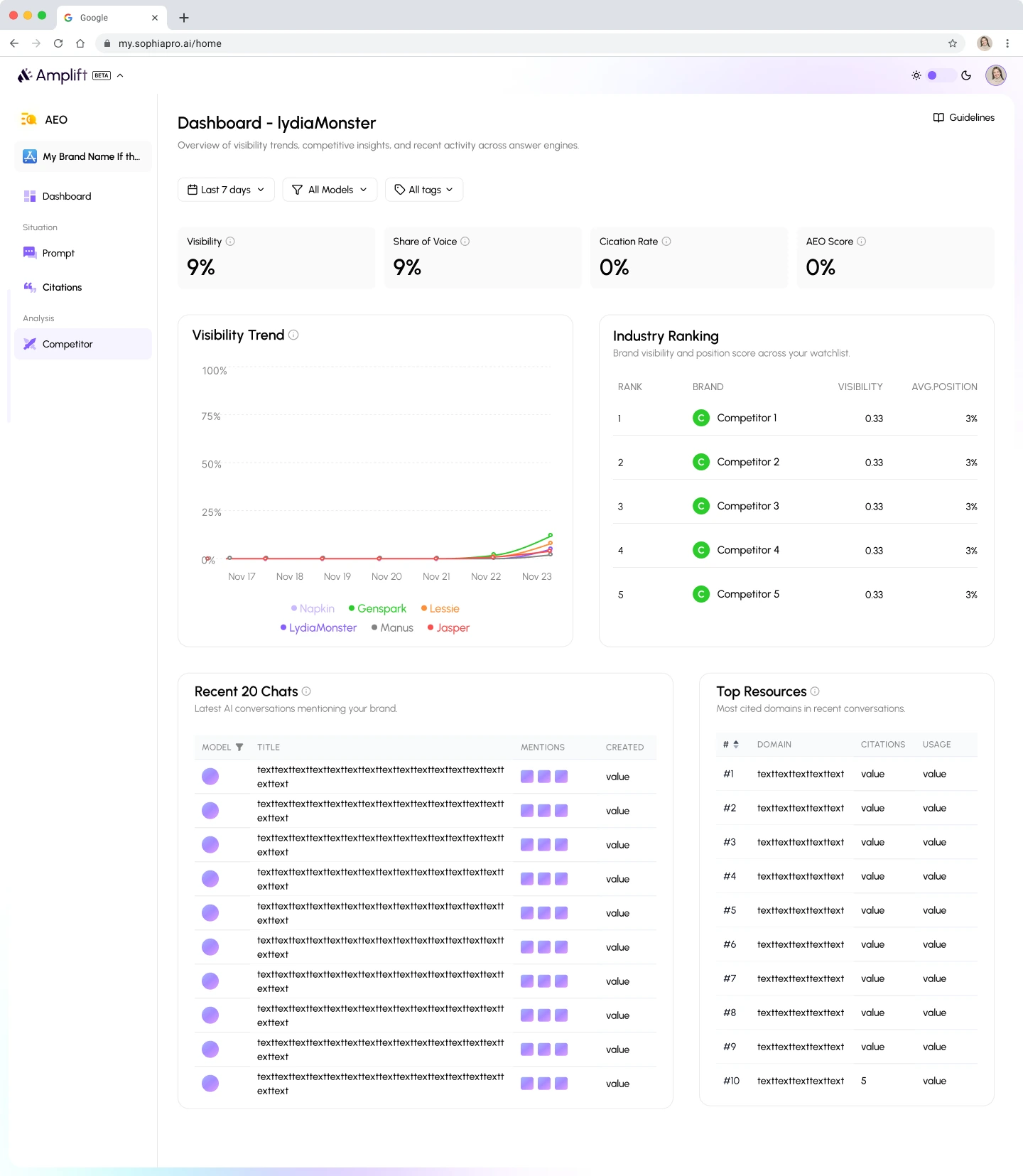
AEO dashboard, with token annotations for engineering around the edges.
A change in practice: bringing generative tools into the workflow
This project marked a shift in my practice. Figma remained my main canvas, while generative tools became a substantial part of the workflow.
Six months, 23 Figma files, 52 key artboards, and three product names. I did not contribute production code on this project. My deliverables were primarily design boards, but Figma Make was already helping me explore directions, build interactive high-fidelity demos, and design onboarding. Three months later, AI moved from a supporting tool to the core of my workflow, taking product decisions directly into code. That next chapter is Clico .